Redesigning the I-ETC Conference's Website


TL;DR
I was hired by the I-ETC conference to help them maintain and later redesign their website. The website redesign involved going through a mountain of information and deciding what was actually important and condensing it down to improve readability.
Once Upon a Time, 3 Buttons Lied
The I-ETC website's look clearly hadn't been updated in quite some time when I started working for the conference. However, I wasn't really there to do a full redesign, I was just supposed to make sure that the information and other content on the site was up-to-date.
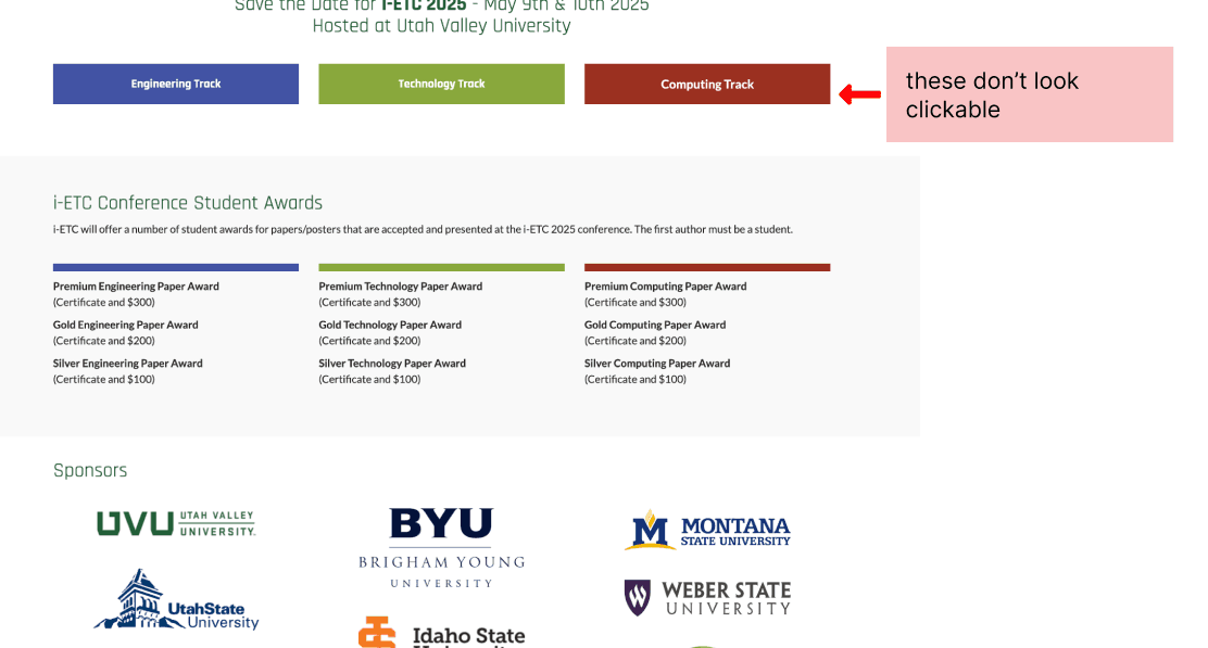
And then I discovered three buttons that didn't remotely look like buttons. They just looked like labels, and I had never tried clicking them before. But when I did click on them, I discovered that they lead to three different pages that were filled with vital information and that no one (including me) knew existed.
At my next meeting with my supervisor, I asked if I could redesign the whole site and he said, "Why not?"
Visual Consistency.
Outside of my nemeses (the aforementioned buttons), the I-ETC website really just had a consistency issue. There seemed to be some confusion about whether the site should include UVU's design system, or if it should have it's own. Since UVU hosts the site, it's design system won. I would've loved to create a custom design system from scratch.
Alas, I leaned fully into the recently updated web design guidelines for the university while still being picky about features in order to maintain the STEM vibe.
However, I really struggled with the organization of content. I found myself rearranging componants a lot, and ended up with several iterations of the homepage that had the exact same design, but just displayed in various orders.
Eventually, I organized based on putting what I thought people were looking for first and then putting what I thought they probably weren't further down. The exception being the keynote speaker which needed to be there for marketing purposes.
Key Takeaways.
Working solo on this design, it took a long time to comb through all of the information available on the site originally and decide what could be removed, what could be combined with something else elsewhere, and especially figuring out what was missing. This site had only had information added to it, never removed so the pure amount of text was overwhelming.
Thus, my key takeaway was on the importance of information hierarchy, and guiding the user through the information without overwhelming them. Organization over aesthetics.
Redesigning the I-ETC Conference's Website
TL;DR
I was hired by the I-ETC conference to help them maintain and later redesign their website. The website redesign involved going through a mountain of information and deciding what was actually important and condensing it down to improve readability.
Once Upon a Time, 3 Buttons Lied
The I-ETC website's look clearly hadn't been updated in quite some time when I started working for the conference. However, I wasn't really there to do a full redesign, I was just supposed to make sure that the information and other content on the site was up-to-date.
And then I discovered three buttons that didn't remotely look like buttons. They just looked like labels, and I had never tried clicking them before. But when I did click on them, I discovered that they lead to three different pages that were filled with vital information and that no one (including me) knew existed.
At my next meeting with my supervisor, I asked if I could redesign the whole site and he said, "Why not?"
Visual Consistency.
Outside of my nemeses (the aforementioned buttons), the I-ETC website really just had a consistency issue. There seemed to be some confusion about whether the site should include UVU's design system, or if it should have it's own. Since UVU hosts the site, it's design system won. I would've loved to create a custom design system from scratch.
Alas, I leaned fully into the recently updated web design guidelines for the university while still being picky about features in order to maintain the STEM vibe.
However, I really struggled with the organization of content. I found myself rearranging componants a lot, and ended up with several iterations of the homepage that had the exact same design, but just displayed in various orders.
Eventually, I organized based on putting what I thought people were looking for first and then putting what I thought they probably weren't further down. The exception being the keynote speaker which needed to be there for marketing purposes.
Key Takeaways.
Working solo on this design, it took a long time to comb through all of the information available on the site originally and decide what could be removed, what could be combined with something else elsewhere, and especially figuring out what was missing. This site had only had information added to it, never removed so the pure amount of text was overwhelming.
Thus, my key takeaway was on the importance of information hierarchy, and guiding the user through the information without overwhelming them. Organization over aesthetics.