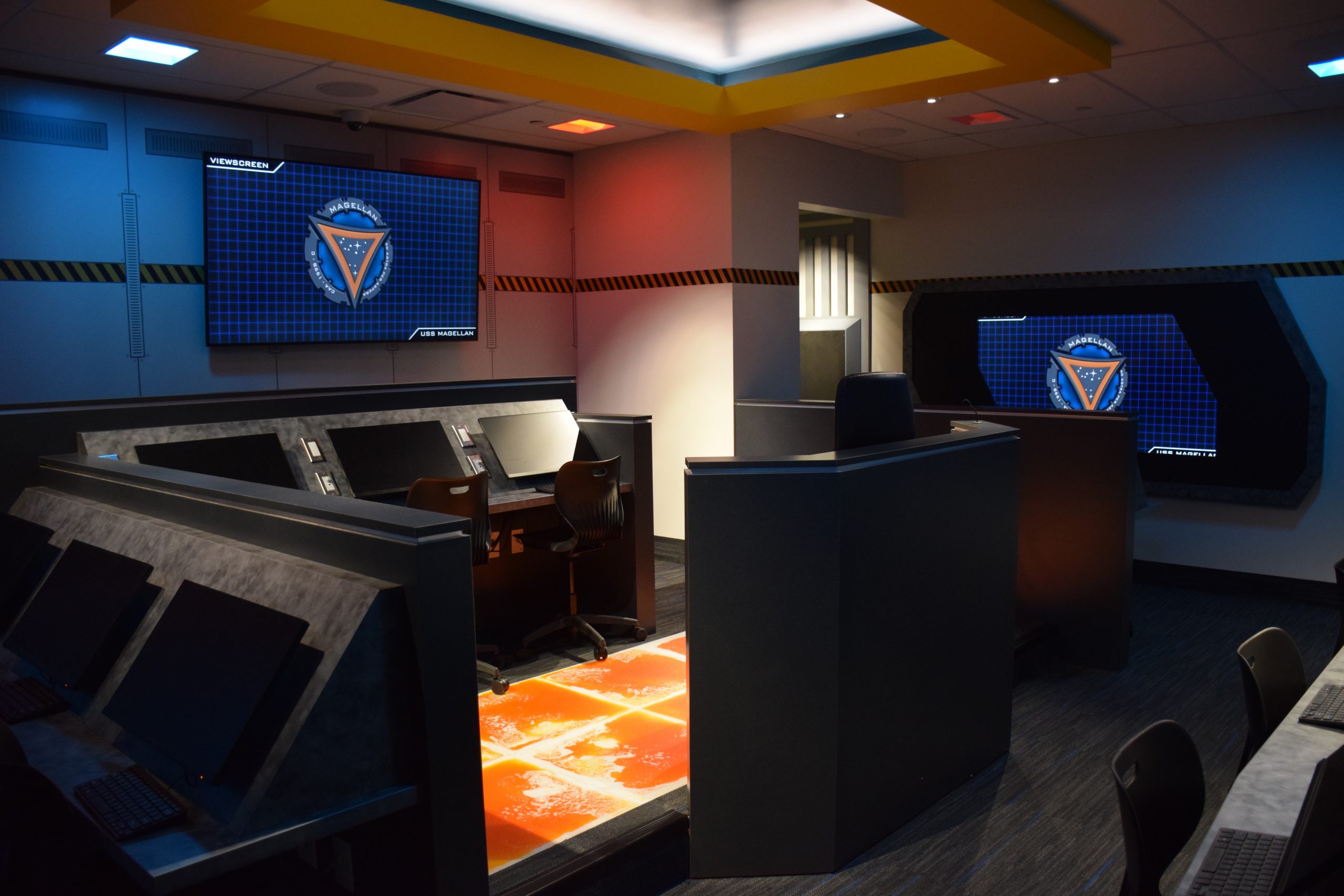
Have you ever wished that you could be in Star Trek? The Christa McAuliffe Space Center is an educational institution that primarily runs escape-room-esque simulations for all your space exploration desires. You can assemble your own team of people to run the bridge of a space ship and complete missions for the knock-off federation.
Recently, the Space Center has been developing an app (EdVenture) as a companion experience to these simulations in order to increase engagement and immersion. Through this app, visitors can track their progress as they are promoted through the ranks of the "federation", as well as revisit their "captain's logs" that they may have created while on a mission.
As a UX research team, our task was to study both the Space Center's audience and conduct some usability testing of the beta app. Allowing us to offer them suggestions about how to tailor the app experience to their audience's needs and expectations moving forward.

the initial research.
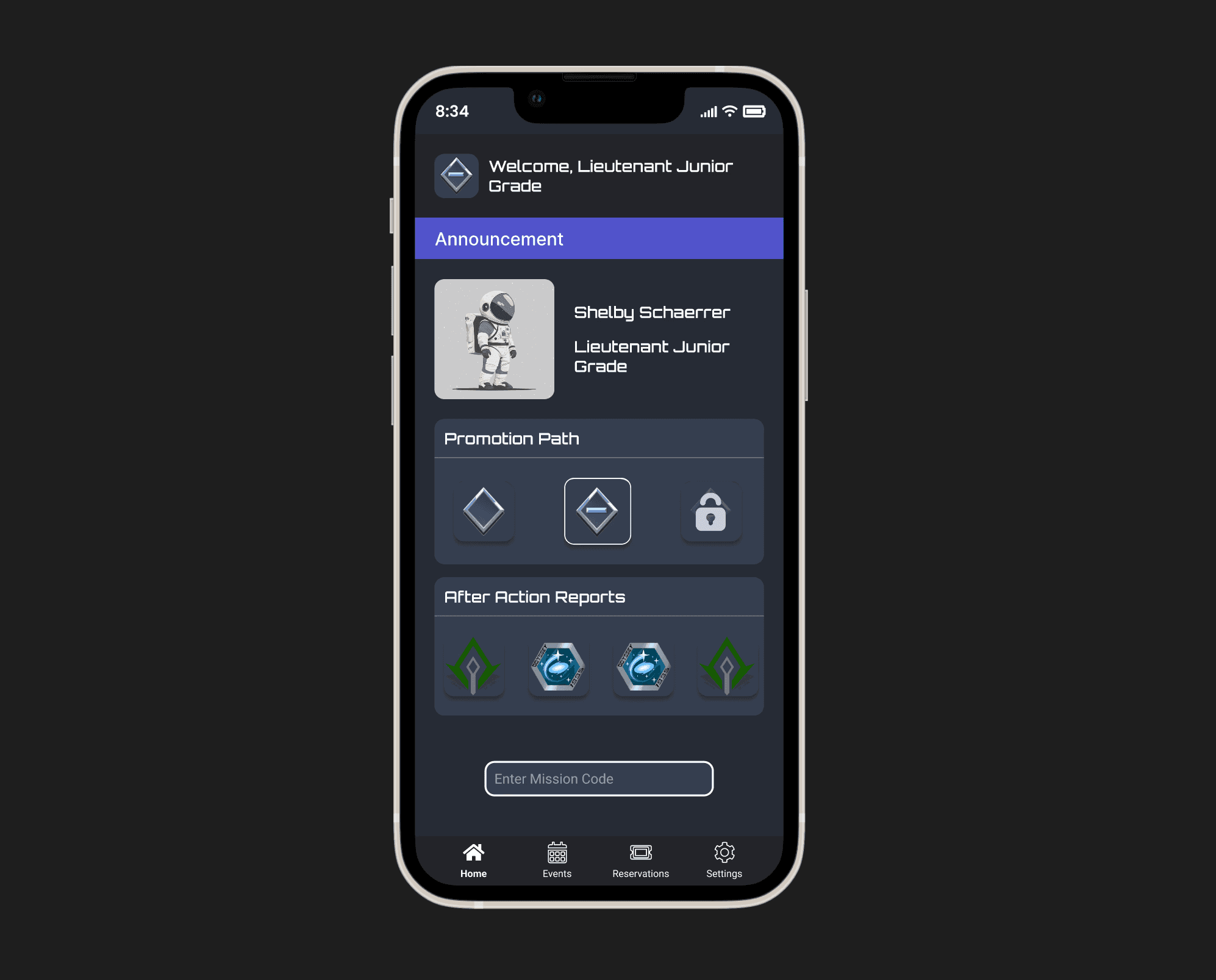
You may notice that this prototype is very nearly identical to the first one. You'd be correct. We were lucky that we couldn't find many problems with our first design, but that doesn't mean it's without fault.
The main thing in this UX spot-the-difference is the word, "Booking". Our users had a hard time knowing the difference between events that you could purchase a singular ticket to, and experiences that you could "reserve" for a private group.
The word, "reservations" worked for both situations, so we changed it to "Booking" to make it a little clearer that it's different from attending a public event.
the first prototype.
Armed with some new data, we started creating a prototype that clones the current app stylistically but also addresses the problem areas we uncovered during our interviews, initial testing, and heuristic markup.
We fixed some basic UX things like the font size (which was originally around 10 - 12px, and we increased it to 14 - 16px), as well as the issues our users pointed out such as misleading naming conventions and confusing navigation.
the second prototype.
You may notice that this prototype is very nearly identical to the first one. You'd be correct. We were lucky that we couldn't find many problems with our first design, but that doesn't mean it's without fault.
The main thing in this UX spot-the-difference is the word, "Booking". Our users had a hard time knowing the difference between events that you could purchase a singular ticket to, and experiences that you could "reserve" for a private group.
The word, "reservations" worked for both situations, so we changed it to "Booking" to make it a little clearer that it's different from attending a public event.
results.
The finished model and photographs produced for STONE MIND exceeded expectations. The product photos delivered a powerful visual impact, highlighting the unique texture and structure of the stones under varied lighting. The model became a striking artistic centerpiece, serving both as an art piece and an effective marketing asset. The images were later used in campaigns and as inspirational visuals within design and art communities.