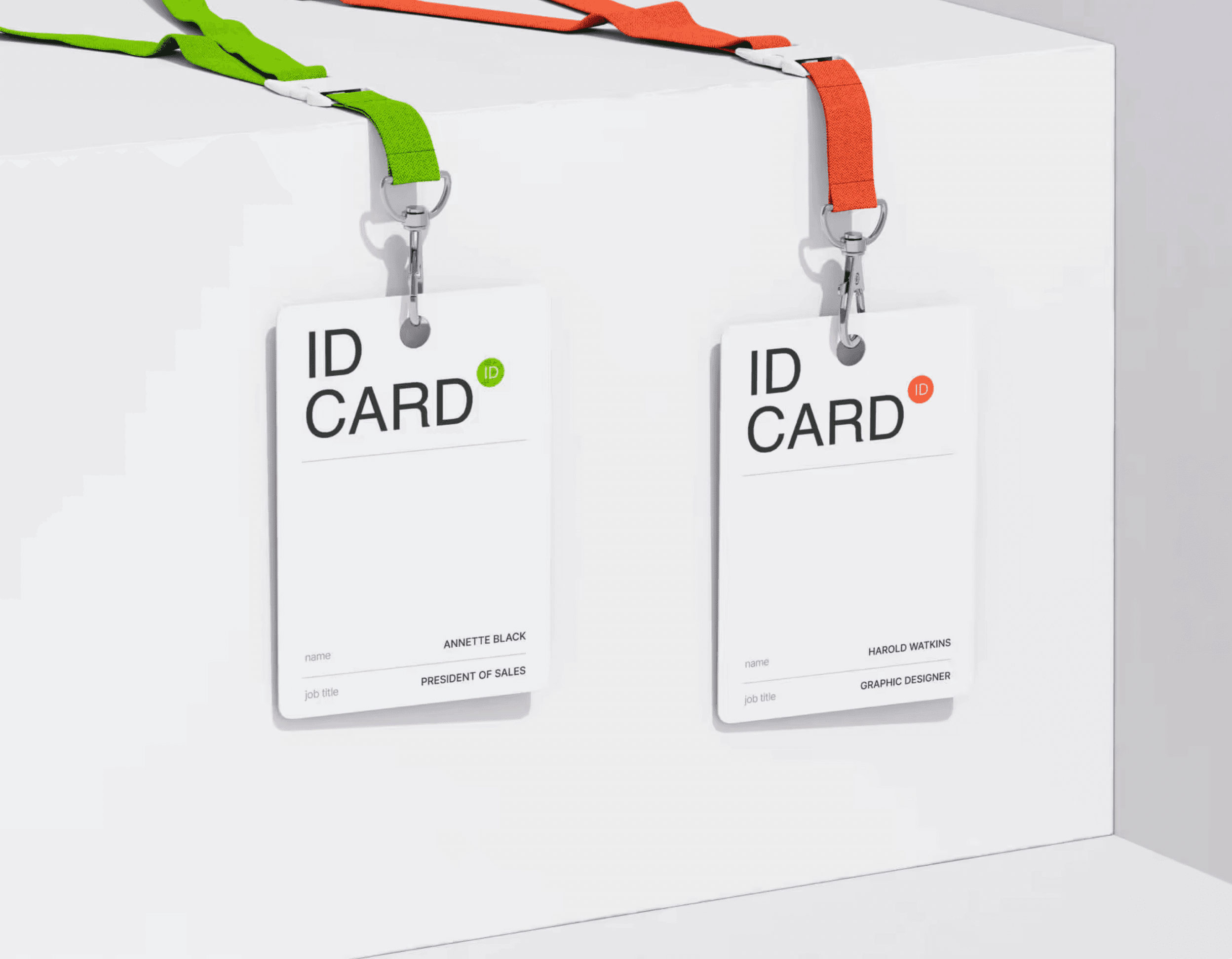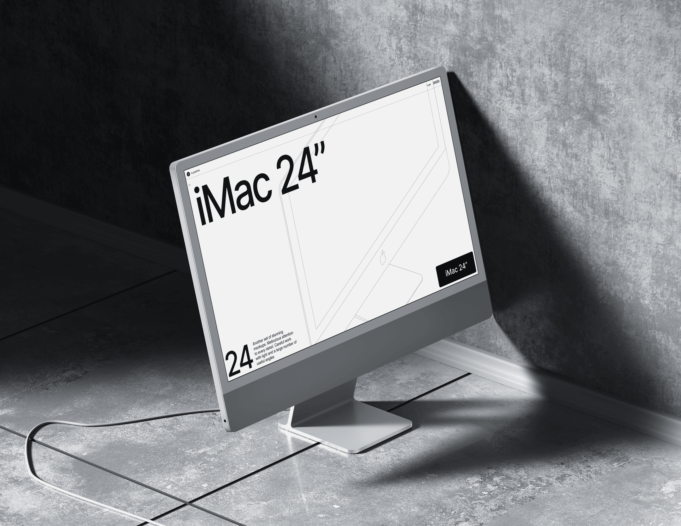
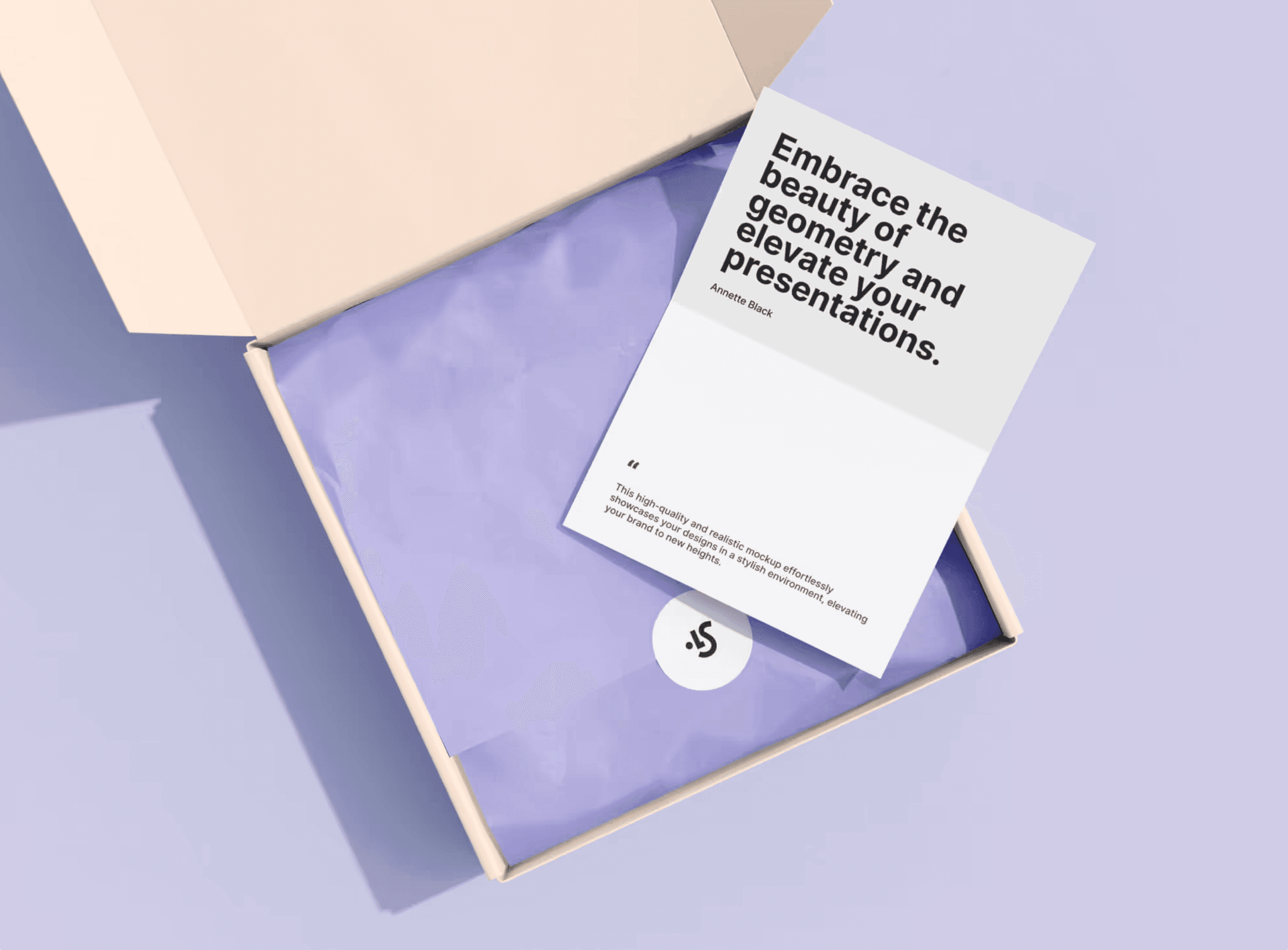
Visual Screen Models is designed for creators who need high-quality, realistic displays for presenting their work. Mockups of devices like MacBooks, smartphones, tablets, and other digital products were crafted with maximum flexibility and realism in mind. Each mockup allows users to effortlessly upload their own designs or app visuals, enabling them to showcase their work in a professional context. This project aims to provide artists and businesses with a tool that helps them present digital products effectively and attractively.
the initial research.
You may notice that this prototype is very nearly identical to the first one. You'd be correct. We were lucky that we couldn't find many problems with our first design, but that doesn't mean it's without fault.
The main thing in this UX spot-the-difference is the word, "Booking". Our users had a hard time knowing the difference between events that you could purchase a singular ticket to, and experiences that you could "reserve" for a private group.
The word, "reservations" worked for both situations, so we changed it to "Booking" to make it a little clearer that it's different from attending a public event.
challenge.
The main challenge was to create mockups that would be not only visually appealing but also user-friendly and adaptable for various graphic styles. Each mockup needed to look realistic, accurately displaying designs without distortion or loss of quality. Perfecting light and screen reflections, so they enhanced rather than obscured the displayed content, was also essential. Creating an intuitive, easy-to-use system for users to customize their mockups was a core focus throughout the project.
the second prototype.
You may notice that this prototype is very nearly identical to the first one. You'd be correct. We were lucky that we couldn't find many problems with our first design, but that doesn't mean it's without fault.
The main thing in this UX spot-the-difference is the word, "Booking". Our users had a hard time knowing the difference between events that you could purchase a singular ticket to, and experiences that you could "reserve" for a private group.
The word, "reservations" worked for both situations, so we changed it to "Booking" to make it a little clearer that it's different from attending a public event.
result.
The final Visual Screen Models product received positive feedback for its versatility and ease of use. These mockups proved to be a valuable resource for both professional designers and emerging creatives looking to present their work at a high standard. The set has been used across online portfolios, social media, and product presentations. Users praised the realistic and high-quality nature of these mockups, which helped give their work a more professional edge and increased project value.