Building Bridges: Designing the Breaking Chains Website for Connection and Support
Designing and building a new website for the Breaking Chains disc golf support group for those in recovery from addiction.
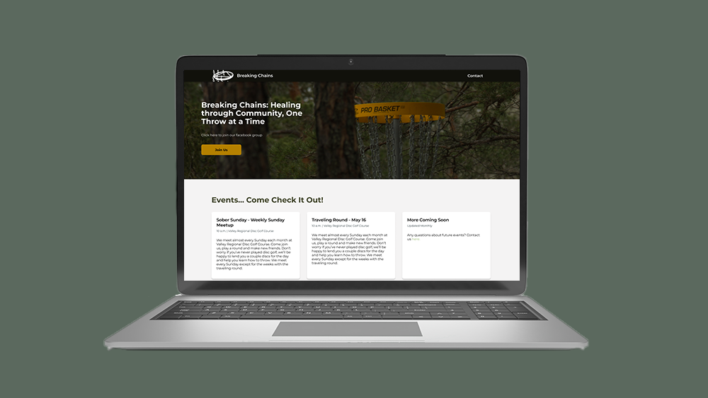
Duration: January - April 2024
Platform: Desktop and Mobile Website
Role: Designer on a team of 2 Designers and 1 Developer
Overview: Breaking Chains is a non-profit organization seeking to help those recovering from addiction by providing a clean and safe environment, and a support group of those who enjoy playing disc golf. They don’t currently have a website, but they need one to find more members and encourage donations.
Meeting the Breaking Chains Group's Needs
The main thing Breaking Chains is looking for, is a way to increase visibility. Currently, information about the group only exists within the private Facebook group they created. A website will allow them to find and help more people, as well as make it easier for those wanting to support the group to donate. Their priority, however, is to make the events available easier to find for those wishing to join.
Helping Those in Recovery
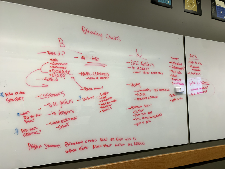
People recovering from addiction are the majority of the Breaking Chains audience. However, there are also a few people who join simply because they enjoy playing disc golf in a clean environment.
We conducted user research via a survey sent out to existing members of the group so that we could get a better picture of their demographic. We learned that a vast majority of members are 30 years old, and older. They also value having a space to better their mental health, and thought that a place to find events is most important for the website.
Optimizing for Web
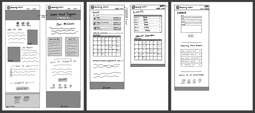
The Breaking Chains group is really proud of their logo, and wanted it to appear in the header as-is. However, a lot of the detail was lost visually because of how small it would need to be. So, I picked the most important part of the logo (the actual chains breaking) and focused on that. This created a logo that was readable in the small header of the website without sacrificing the group's original logo idea.
The original logo is on the left, and the new simplified one on the right.
Learning to Pivot
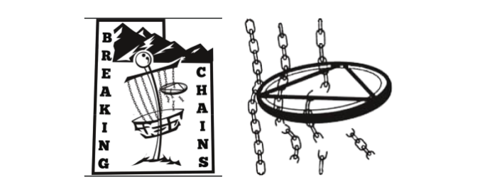
After we had created the first wireframes and the first version of our surface comps, it was clear that something was very wrong. The page wasn't interesting to look at at all, and was certainly not going to hold anyone's attention very long. I knew it and my fellow designer knew it, we just didn't know that we were on the same page. We both thought the other liked it and didn't want to step on any toes so we sat on the mediocre design for a few weeks trying to convince ourselves it wasn't actually that bad.
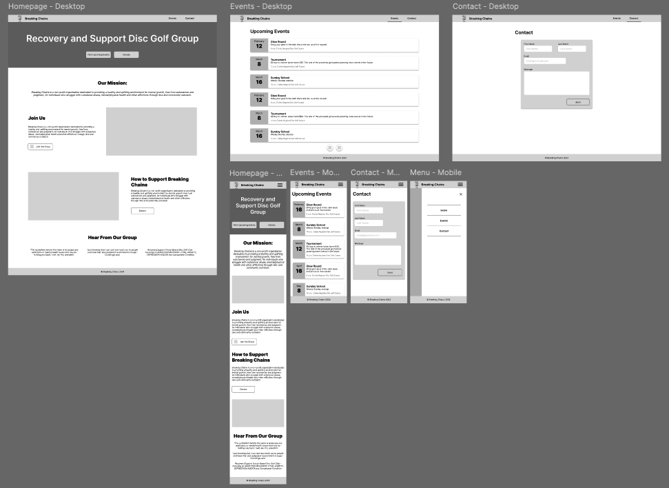
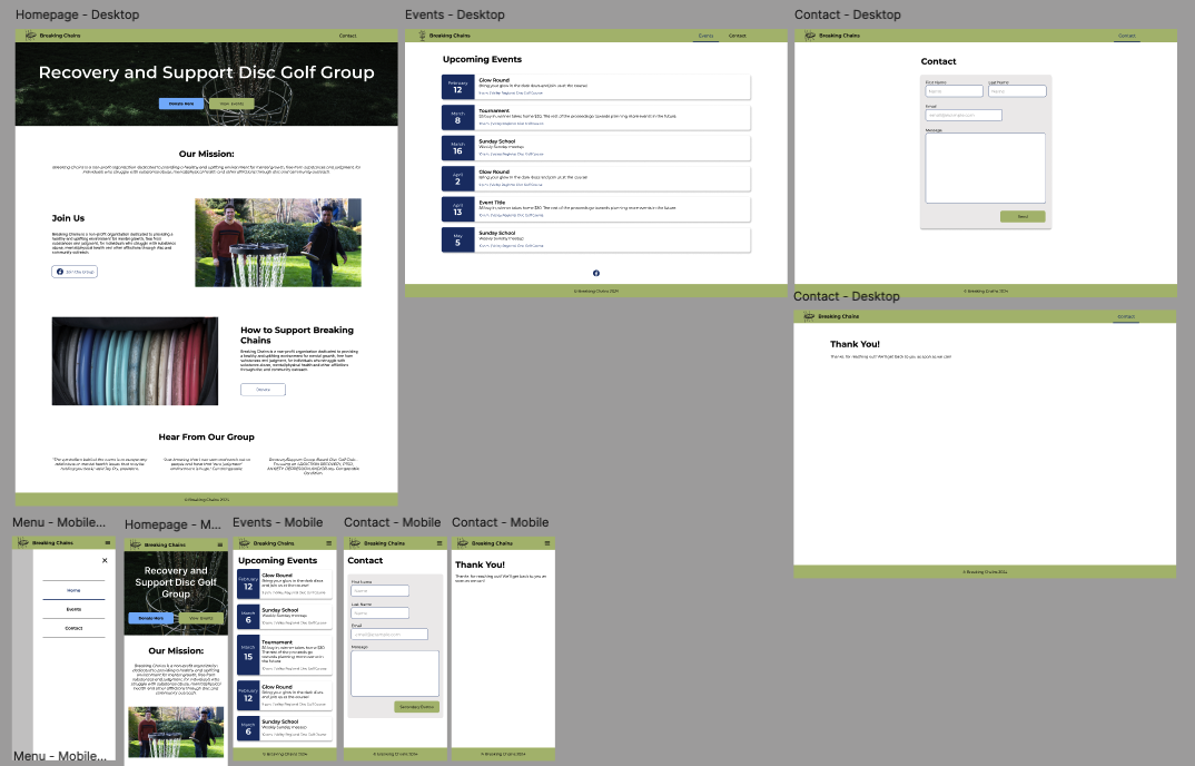
We nexted attempted to fix this design by adding to it, because why not throw a few more logs onto the fire? We tried to create a narrative that would make the page more interesting to read through, and perhaps appeal more to those who could potentially donate to the site. We wanted to make sure the site said why the user should care about breaking chains. We also combined the events page with the home page, since we learned the group doesn't have events very often.
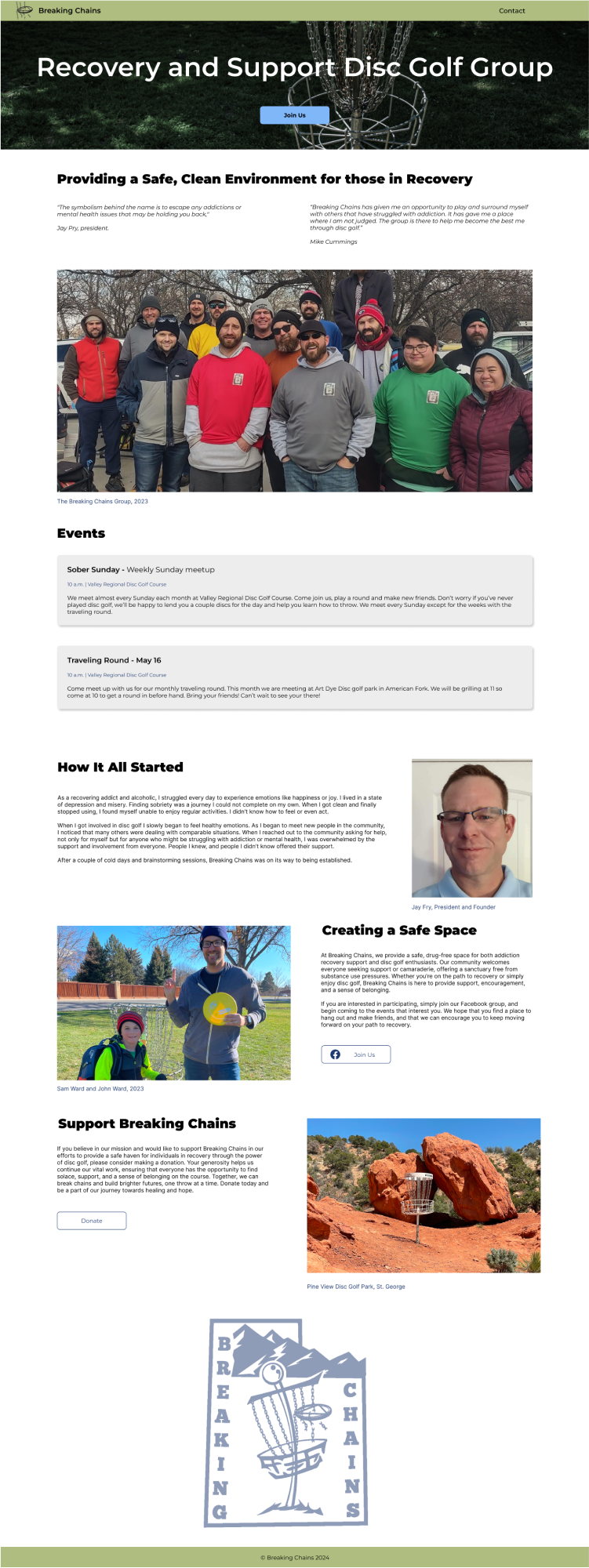
Version two was definitely an improvement on the original, and we thought we were done (I had made my peace knowing I would never put this project on my portfolio). Then a miracle happened, the other designer and I actually talked to each other about how much we hated this design. We realized that we had both been trying to not step on the other's toes, and as a result we had a project that we both hated.
This revelation lead to us sitting in the common area of the Computer Science building at UVU and starting our design over from scratch. We knew that in order to have a chance at having enough time for development we would need to have the new design done that night. So we spent the next three hours collarborating the way we should have from the beginning.
The results?
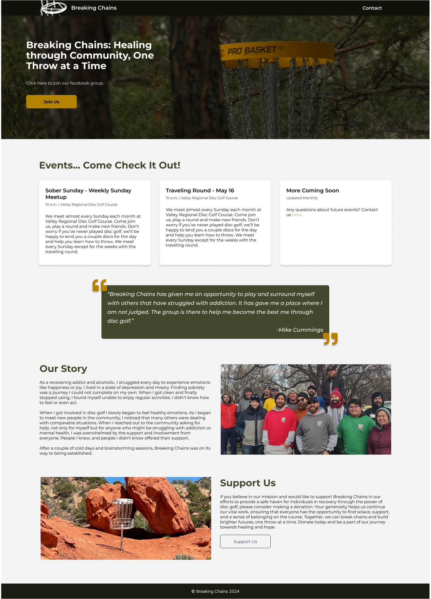
A homepage that maintains the narrative we wanted, while also portraying the seriousness of the group. It feels like a website a sports group would have, and it meets all the needs of the client. It finally was a good enough design for me to put it on my portfolio.
This project taught me a very important lesson. Although we talk a lot about how to be considerate of others in group settings, we don't always mention the importance of being true to your design vision as well. The other designer and I were too worried about being "mean" to each other, when our focus should have been more on creating something amazing even if we would disagree on certain items. In the end, it's about doing the job that needs doing.
Unfortunately, despite us cramming to get this design done on time, our developer didn't get around to developing this website. Or participating in any way actually. I'm not salty about it at all (this is sarcasm). But! You can explore our prototype below, and check back in the future to see when the site gets developed by the other designer and myself. Sometimes you just gotta get your hands dirty and do it yourself.