Beauty in Functionality: Redesigning the EDAS Website's Navigation and Aesthetics
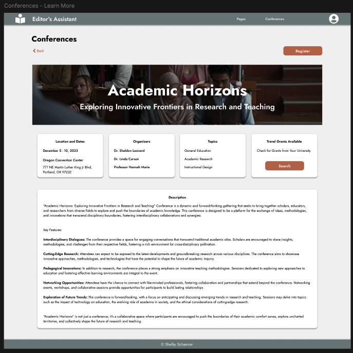
A hypothetical redesign of the Editor's Assistant website.
Duration: November 6 - December 9, 2023
Platform: Desktop Website
Role: Solo Designer
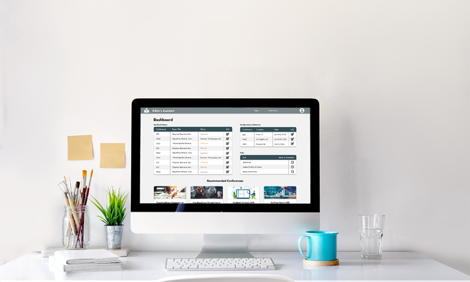
Overview: A school project to redesign the EDAS (Editor's Assistant) website in order to improve the navigation, organization, and overall functionality. This project covers the design process through the handoff preparations needed for a hypothetical developer.
Analyzing the Current Website
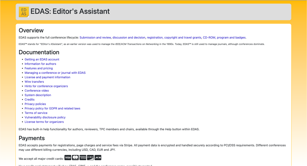
To be completely honest, the day we went through the current website in class was the most I've laughed in a long time. Trying to find anything on the website was difficult for our professor (who is familiar with the site), I can’t imagine what a nightmare it would be for a new visitor. It also didn’t follow any design conventions which was infuriating. For example, clicking the logo in the navigation bar (that should navigate to the homepage) prompts the visitor to log out of their account instead.
Simply put, the EDAS website was in great need of an overall rehaul.
Why Would Anyone Use it in the First Place?
...is a question I found myself asking that first day. It turns out that if professors want to submit papers for certain conferences, they have to use that website to do it. It also allows them to sign up and pay for conferences, as well as receive travel grants.
Keeping this in mind, I wanted to make sure that my design organized everything intuitively so that professors don’t have to wade through mountains of information just to complete simple tasks.
The Bumps in the Road
The thing that made this design challenge difficult was handling the enormous amounts of information available on the original website. Choosing how to organize it all was a little difficult, as well as knowing what to cut and what to keep.
Creating a Prettier, More Functional Design
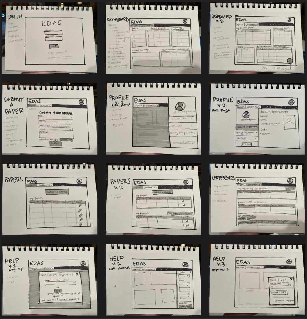
After going through the website with our professor, and a good group whiteboarding session, we individually began sketching what we wanted our designs to look like. I really wanted to make sure it was clear what information was available and where, to cut down on the time someone would normally spend wandering around.
Next I created my wireframes. trying to pay special attention to organizing information so that navigating around is more intuitive. I also wanted to make sure the data tables were clear and aesthetically pleasing.
At this point, we received feedback in class from our professor and peers on our layouts and organizational ideas.
Finally, it was time to create the surface compositions based on the feedback received for the wireframes.
By the time I got to the surface comps, I was having a really hard time with the color scheme (which is something I’ve never gotten caught up on before in web design). I originally had a green and orange thing going on, but after some peer reviews I realized that it made it look like a garden website. Luckily the blue and copper-y color scheme fits the academic vibe a lot better.
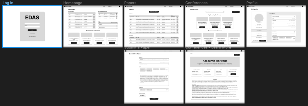
Reflecting on My Design
This project was very satisfying to work on. Like watching a time lapse of watching a house that was hoarded get reorganized and cleaned. Its a fitting metaphor actually, since there was so much going on on the original website, and it was all stacked on top of more and more random bits of information. And it was hard to walk through.
The main takeaway from this project is definitely learning how to organize and display large amounts of information so that everything is understandable and pretty at a glance.
My design is definitely a nice, squeaky clean face lift of the original, while maintaining everything a visitor would need from it. This project really emphasizes the importance of organization and navigation in a website, especially one that is used so much.
The Final Outcome
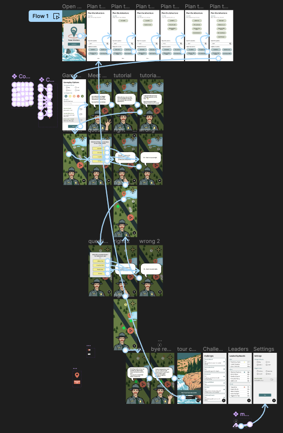
Overall, I'm very proud of this app. If I knew how to prototype in Figma better, I think I could make a better representation of my idea and I'll probably adjust it in the future. Beyond that though, I think I have a really cool concept and I think it looks really good aesthetically.
Check out the surface comps I made below, and explore my prototype.


