A Brighter Future: Updating the Feit Electric App for a Modern User Interface Experience
A hypothetical redesign of the Feit Electric company's app.
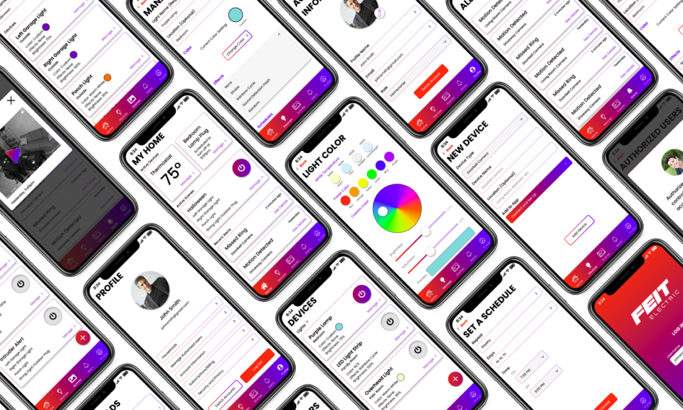
Duration: October 23 - November 4, 2023, updated March 2024
Platform: Mobile App
Role: Solo Designer
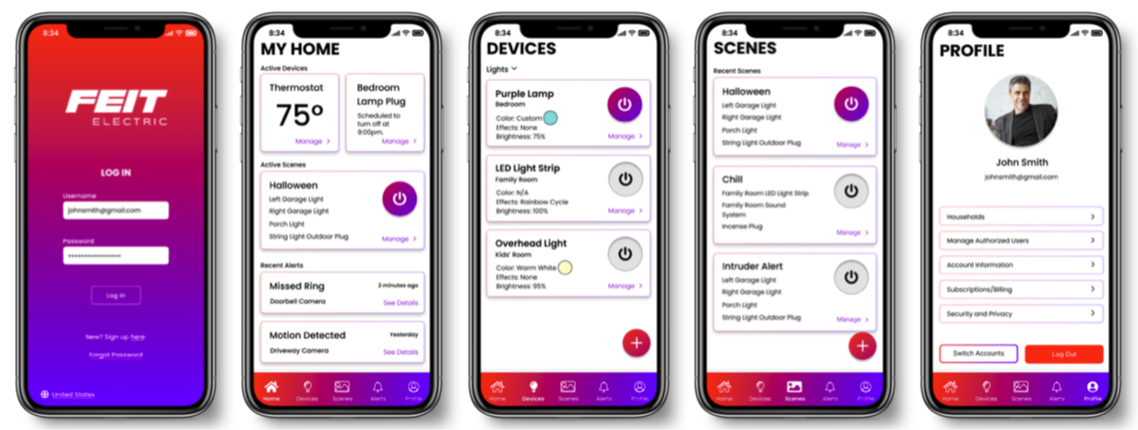
Overview: The Feit Electric Company currently has an outdated looking app that also has poor navigation. This class project sought to fix both of those points. I’ve created an option for their app that matches the overall aesthetics and feel of their new website, and also is more intuitive to use.
Considering the Problem Areas
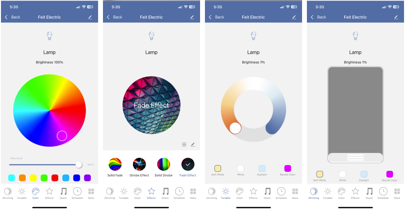
I actually bought a Feit Electric smart light bulb and downloaded the app myself. I found that certain pages were very difficult to navigate to, in particular the light settings are hidden. In order to access them you have to press and hold down on your device’s icon for three or four seconds, and then the settings open. This mechanic is not at all intuitive, and is problematic for accessing pages you’d need to find somewhat frequently.
Additionally, I discovered that about a week before our class started this project, Feit Electric redesigned their website, updating their color scheme and logos. Unfortunately, as of October last year, their app did not recieve the same face lift.
With that information in mind, my goals were to improve the apps navigation and update the interface to match the Feit Electric website’s rebrand.
Designing with the Target Audience in Mind
While revising an expanding on my original design, I decided to do some research on my own of who the Feit Electric app user base might be. I couldn’t conduct research on the actual users, but I looked into statistics surrounding smart home device consumers.
I found that most consumers are millennials and gen z. However, some of the articles I read also pointed out that more and more baby boomers are also getting these devices in their houses in order to live independently longer.
My two goals for this website meet the needs of this target audience because the younger generations will appreciate the improved aesthetics of the app redesign, and improving navigation will help the older portion since it will make the app easier to use. Especially for those who aren’t very familiar with technology and/or smart phones.
Team of One
Since this is a school project, all of the design presented in this case study is my own. There were class discussions about general functionalities and such, but this is representative of my sole work as a designer.

What This Project Was and Wasn't
This project was given to my class as practice for design, and, as such, none of us worked directly with or had contact with Feit Electric themselves. We also only worked up to the surface compositions within the class, with no intentions of moving further in the design process. Although, I did create a prototype for demonstration purposes within my portfolio.
Additionally, this project was originally completed within about two weeks.
The Design Process Utilized
The first thing we did in class was take a look at the existing app. Our professor showed us how the app works on his phone, demonstrating how it controls one of the lights in his garage. This allowed us to witness the problem areas. We then had a few discussions on how the ideal app would function, as well as who we think we would be designing for. Our conversations were concluded by whiteboarding what specific features the app needed.
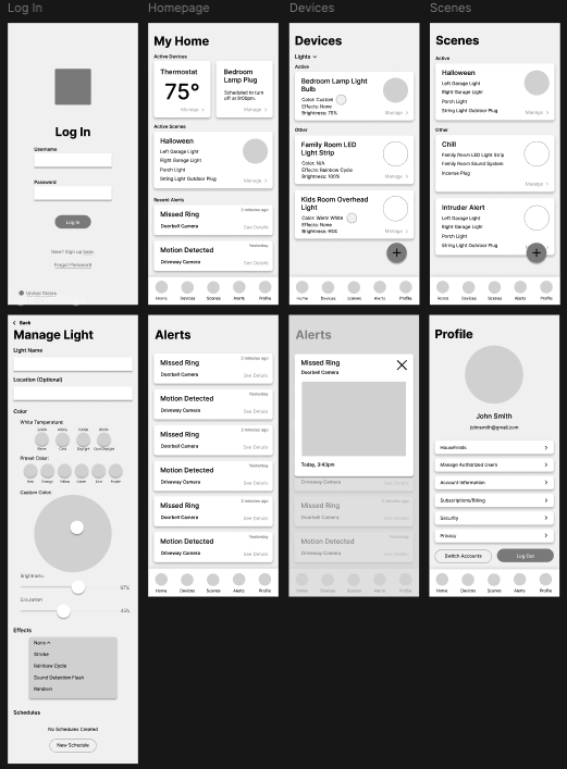
After that, we were on our own to begin mood boarding, sketching, and wireframing. This is were I began to really hone in my ideas for improving the navigation. Originally, (as seen below) I just piled all of the light settings onto one page. This page was really easy to find, but unfortunately the amount of information was rather overwhelming. My first set of surface comps include that idea.
However, when I revisited this project a few weeks ago, I decided to take the feedback I had received from my professor regarding the settings page, and separate the kinds of settings out into their own pages. They’re all still very easy to navigate to, but the amount of information is no longer overwhelming as you only need to look at the settings you are actively changing.
My Final Product
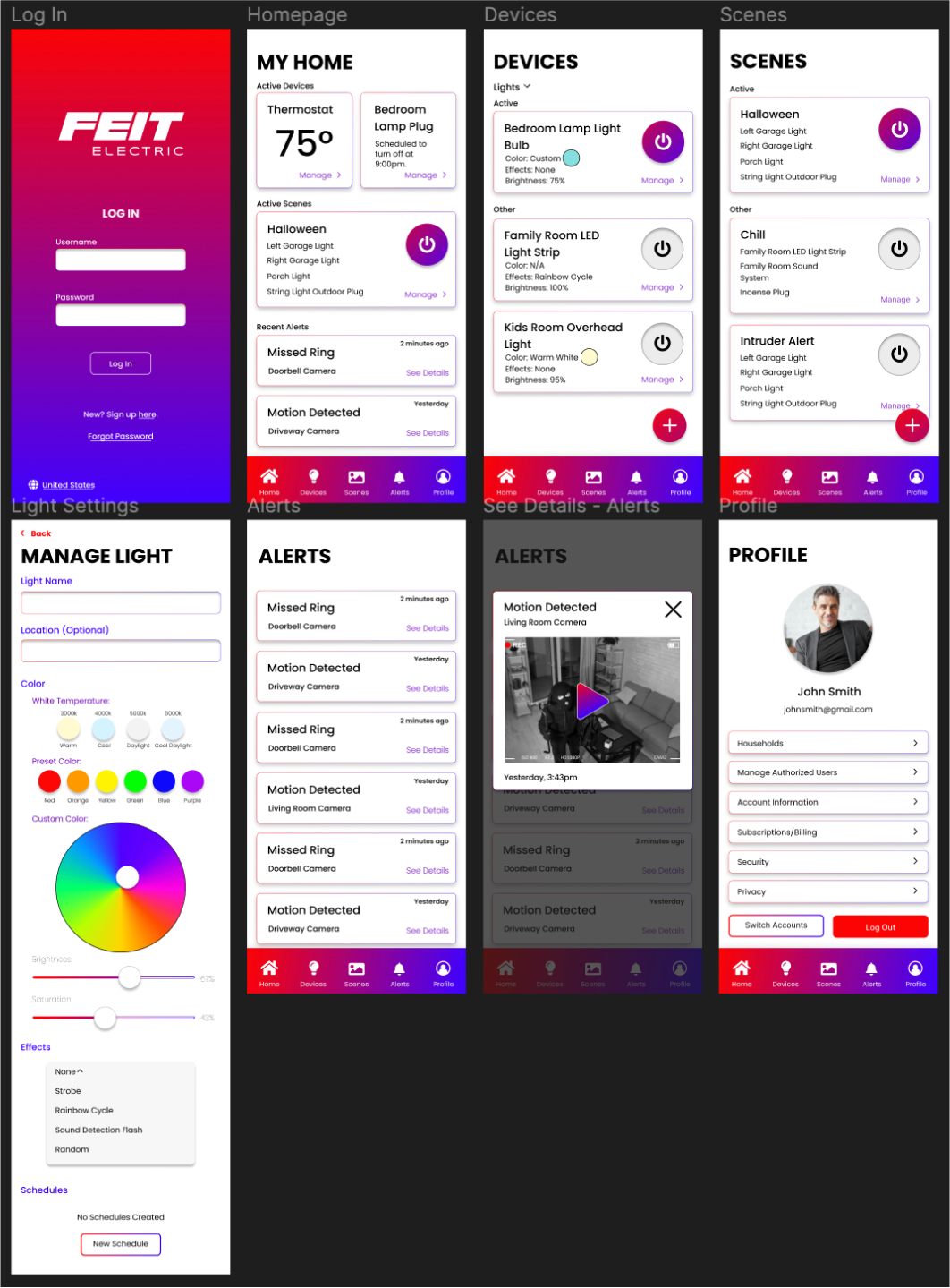
At this point (after some revisions), this project has completed both of my goals. The navigation is significantly better, and the app matches the new website. I’m very proud of it. I learned to incorporate bold visual themes (such as the gradients) without it interfering with/distracting from the functionality.
Be sure to check out my prototype!
 Check Out My Prototype