Designing for STEM
Maintaining and Updating the I-ETC Conference Website
Duration: October 2024 - Ongoing
Platform: Website
Role: Web Design Intern; handing off to a developer intern
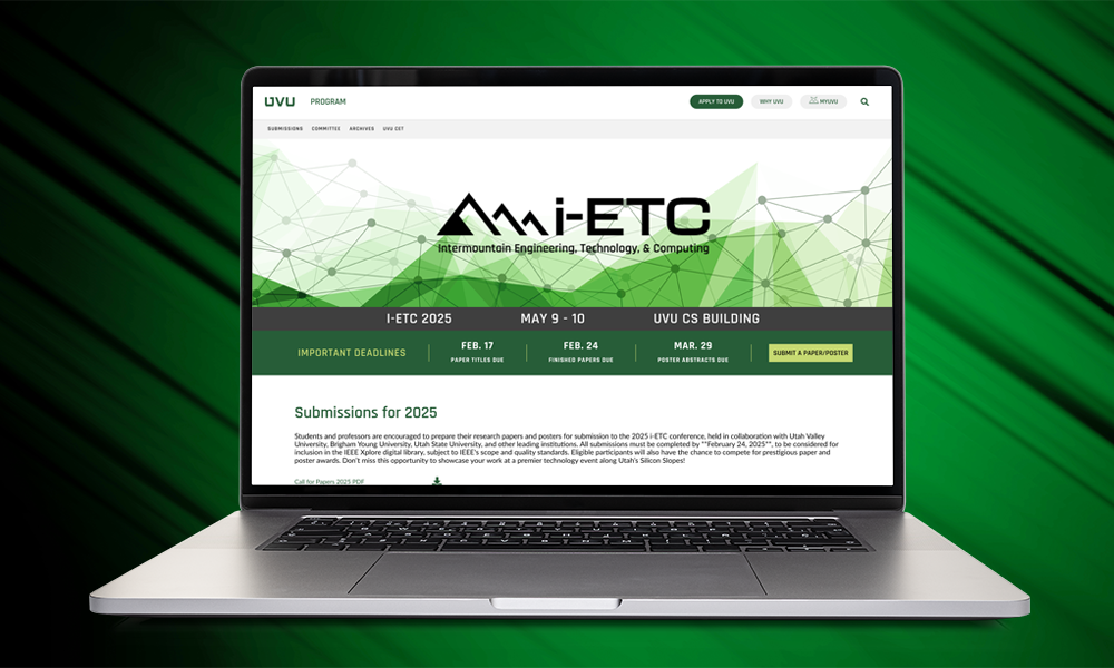
Overview: Every year, several universities and companies get together to discuss the latest innovations in the Engineering, Technology, and Computing fields. I'm in charge of maintaining and updating their website hosted through UVU, as well as design supplementary materials such as digital signage.
This project is currently in progress, please check back soon for updates!
Once Upon A Time, Five Buttons Lied
Before I was even interviewd for this position, I took a look at the I-ETC website. I looked at every page and literally pushed every button. I don't think my interviewer was expecting me to know exactly how many broken links existed on each page, but I did.It was frankly, kind of ugly as well and I knew that the transformation I had the opportunity to create was going to be really satisfying. But that's long-term, let me show you what I've done so far, starting with the homepage.
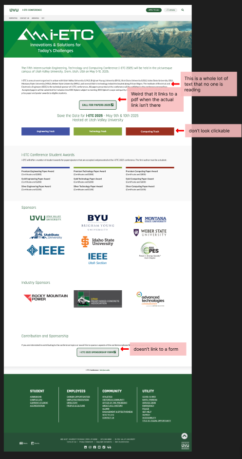
Once I was hired, I did a more formal full heuristic markup of the page. The main thing that I learned by combing through it again this way, was that features on it just seemed a little confusing. The main thing being that the first button which said, "Call for Papers 2025", linked to a pdf. I thought that it would go to a form or submission page of some kind, because it was a button.
Beyond the button that felt like it shouldn't be, there were buttons that didn't seem like they were buttons! Seriously, for the first few months I worked here I forgot those three pages existed because the buttons didn't look like they were clickable.
To continue my gripe with all of the buttons on this page apparently, the very last button says, "...Form". Now, if there was button that SAYS it links to a FORM, wouldn't you expect it to link to a form to fill out? It linked to a pdf.
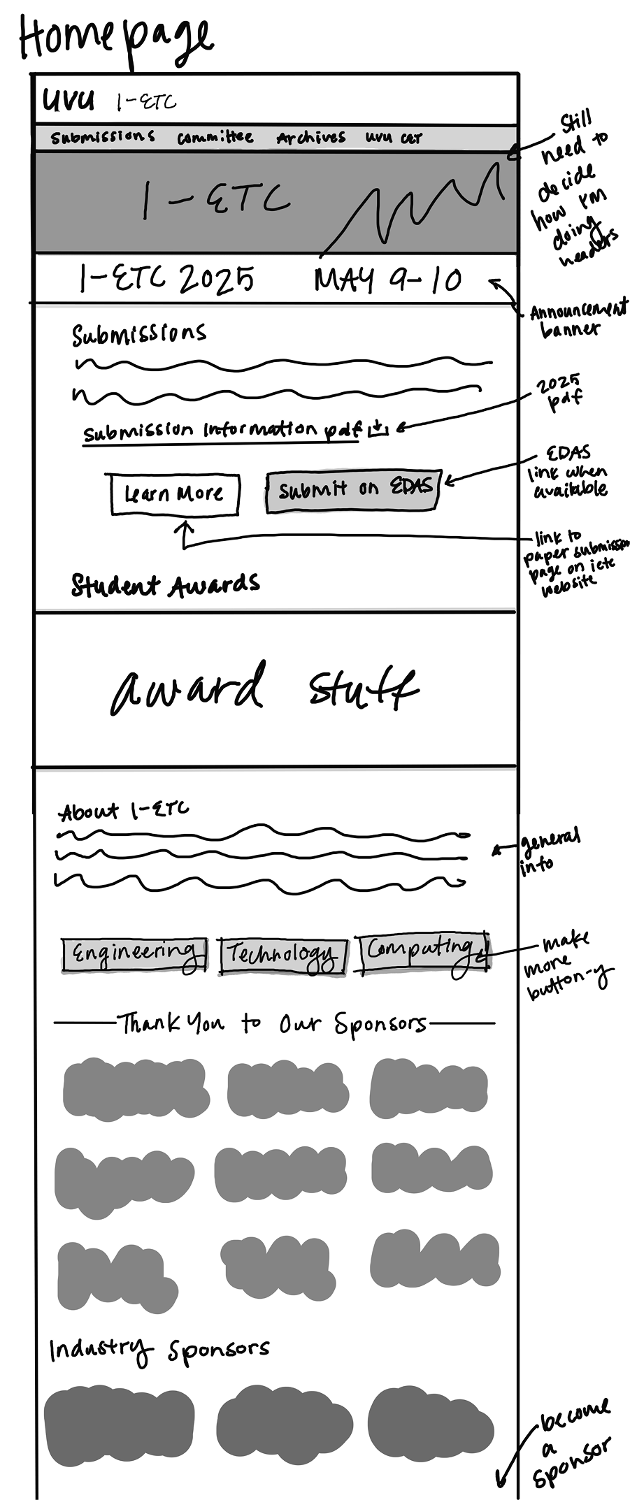
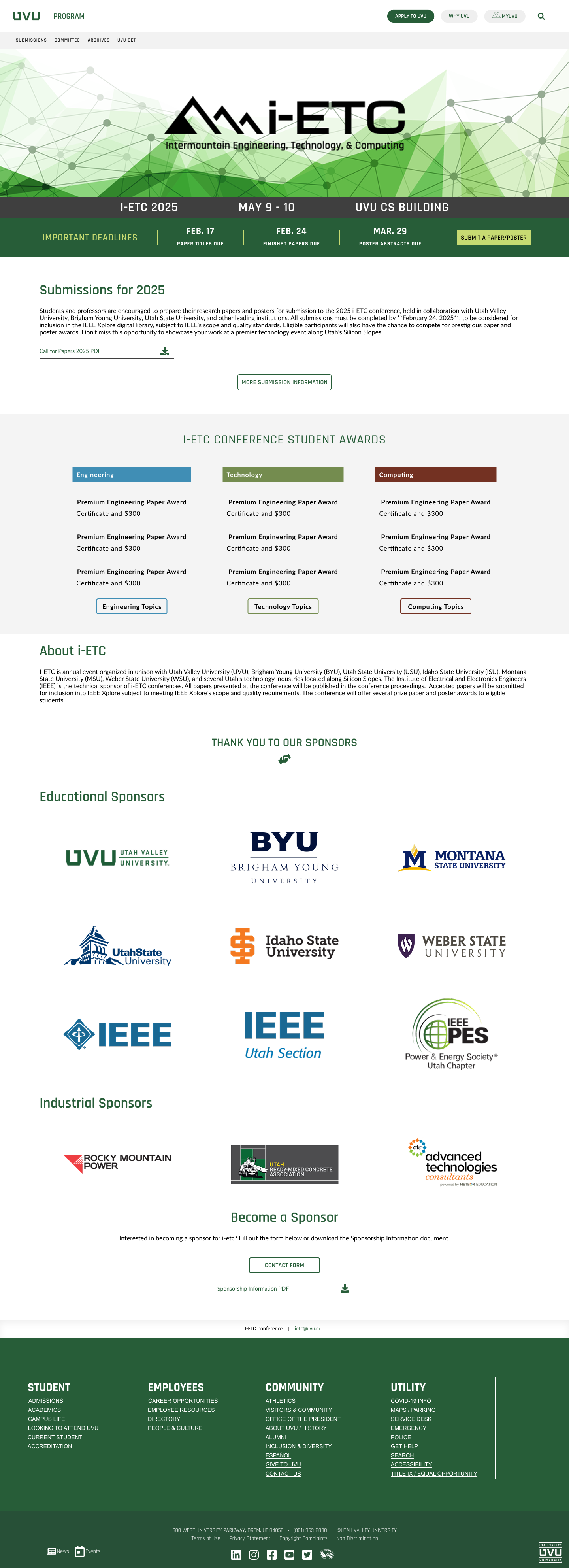
When I started sketching out my ideas for this page, you can see that I was quite determined to set these buttons straight. Links to pdfs would be links to pdfs, and buttons would link to pages in the website appropriate to their calls to action.
The other main thing I added was a banner underneath the hero image that would show the dates of the next conference. Before, the dates could only be found by opening up the pdf or by scanning through a mountain of text. I figured that finding the dates might sometimes be someone's only reason for visitin the website, I didn't want to make them work for it.
Creating the Blueprint
The next thing to do was create a wireframe of the homepage (and the other pages I'm working on, but they're not done yet). While building the wireframe, I took a look through the official UVU web design system and found that there was already a component for a banner with important dates! It was originally used to remind incoming Freshman about application deadlines, but it existed all the same. That was really exciting because it meant that my idea wasn't totally random, and thus would be an easier sell once I pitched my design to my boss.
And I did show this wireframe to him, and the important deadlines reminder was a hit!
Honing In Onto the Vision
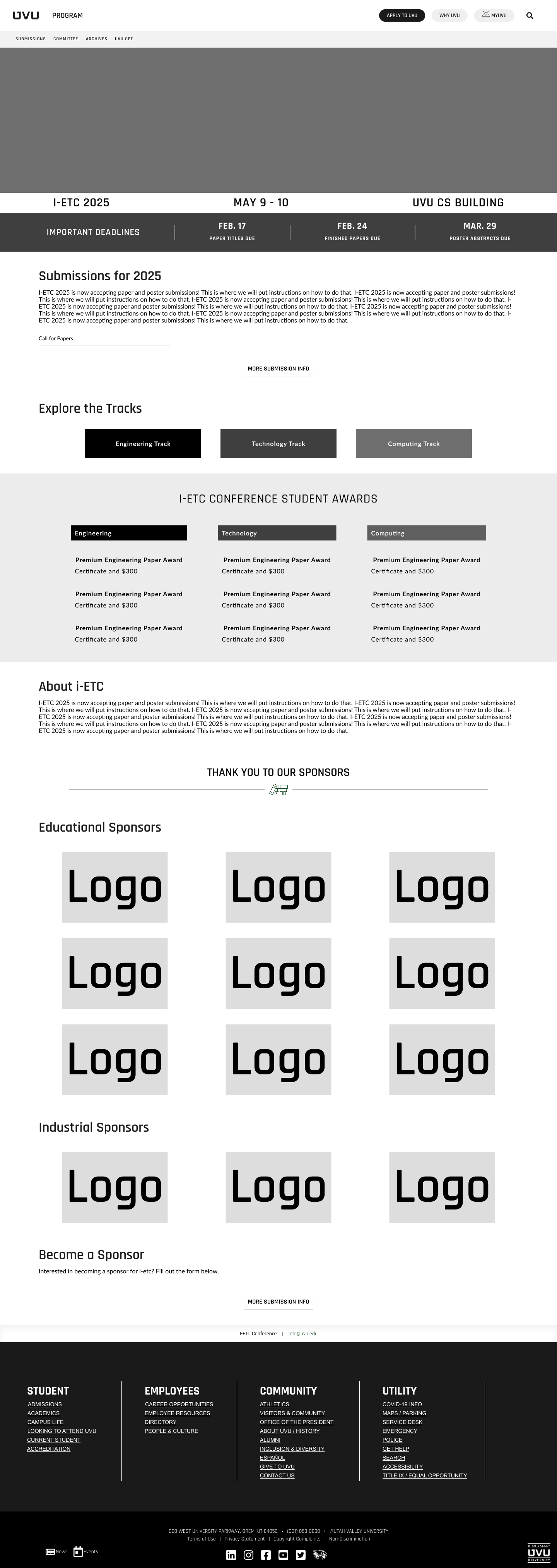
From this singular wireframe, I jumped right into the high-fidelity design. But it was not all sunshine and rainbows from there. My boss had a few new suggestions about buttons (evidently we both have gripes). He gave me some more ideas on how to make even more sure that it's obvious what's clickable and what's not, and also wanted me to add a button for submissions into the deadlines banner. So, after a few iterations, we now have the final design for the homepage.
Please note that the final hero image has not been decided on yet, I know it's weird right now.
The Handoff and The Signage
Handing this design off to our developer was honestly a lot smoother than I was expecting it to be. I gave him the figma file and some image and link references, and he had built the whole thing in a few days. A few minor tweaks here and there, and the page is live just in time for students and faculty to start submitting their projects to the conference.
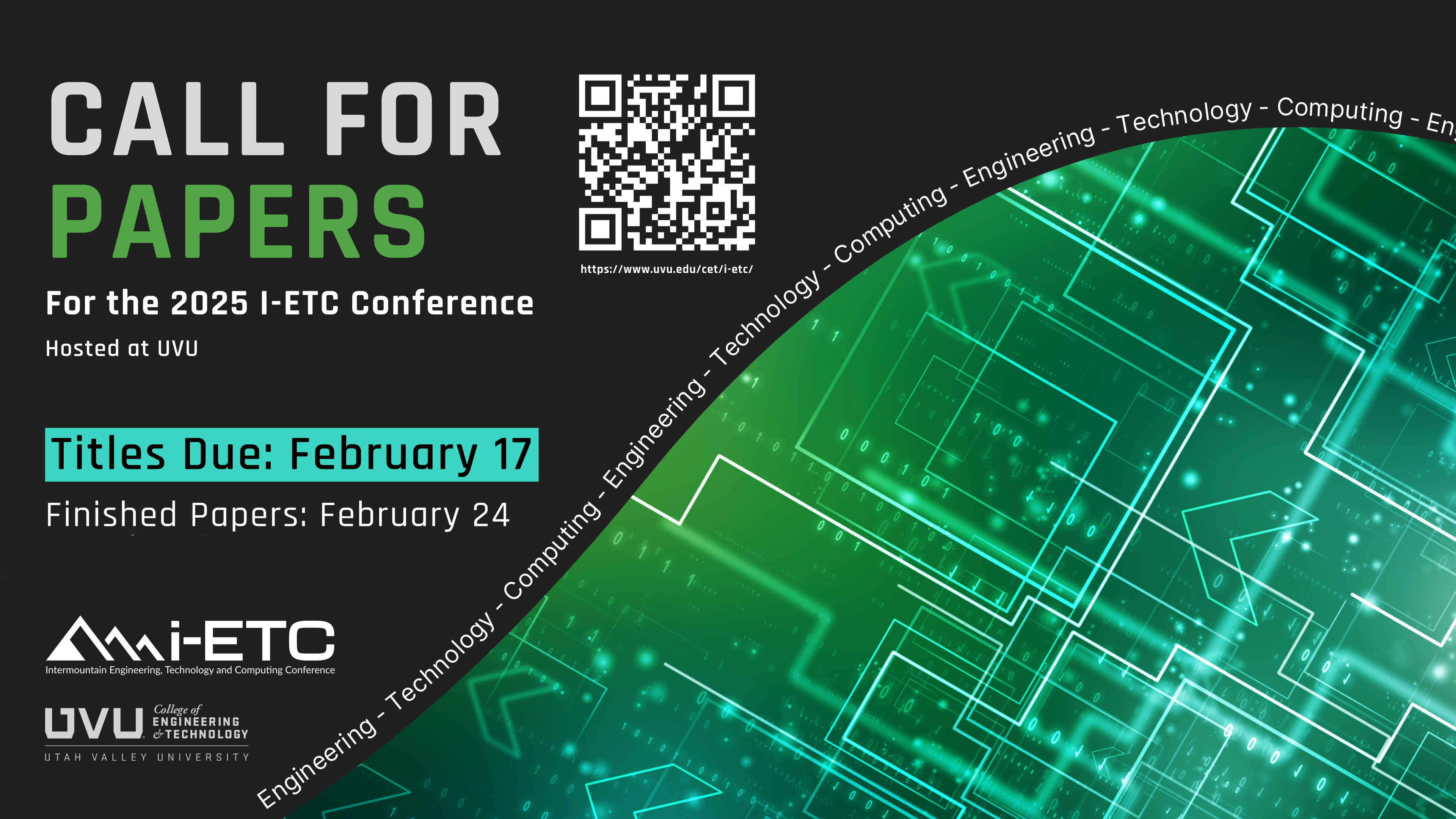
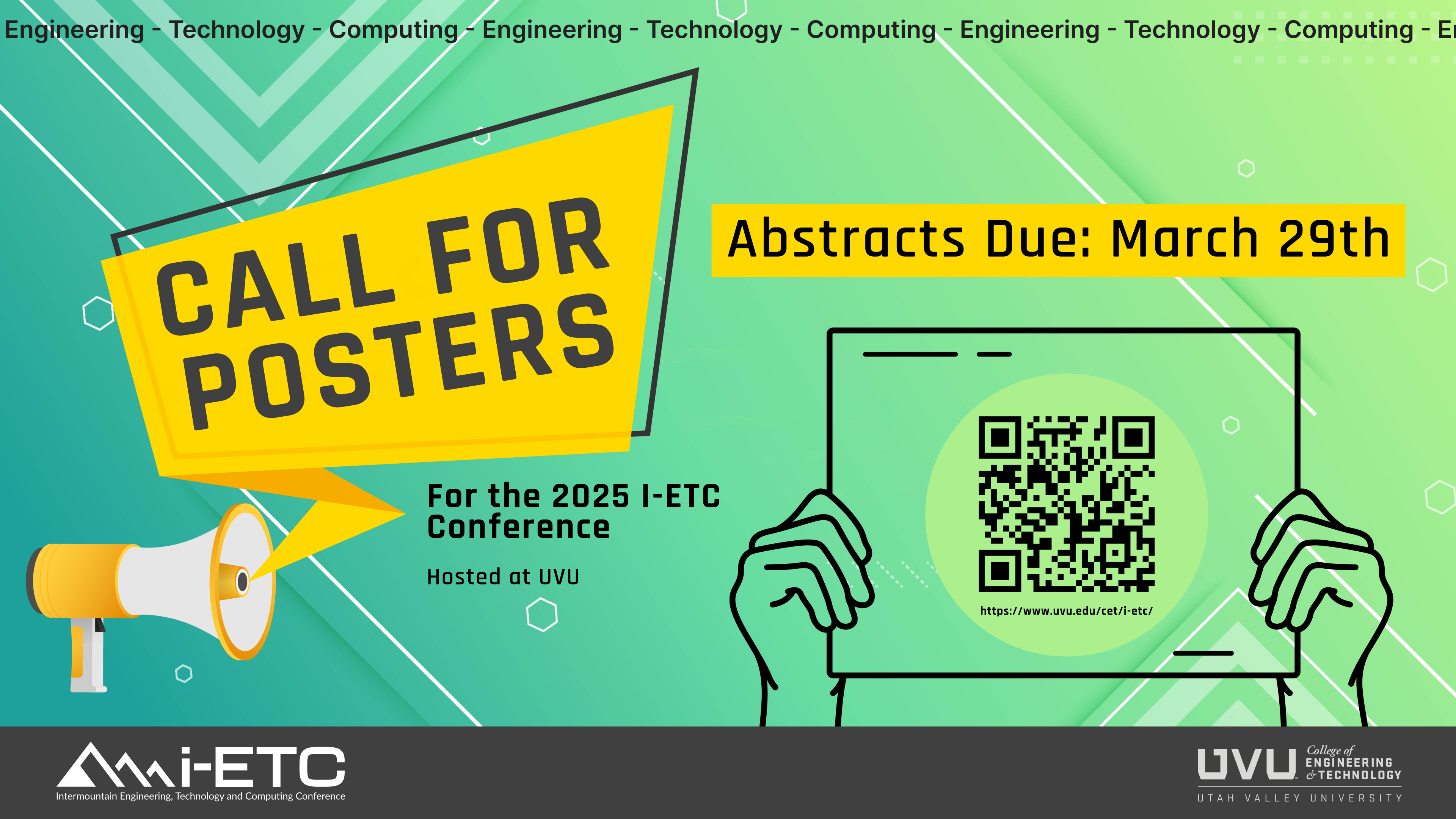
Once the homepage was done, it was time for advertising efforts to be maximized. So, I've officially put the website redesign efforts on pause, and created two digital signs that will be displayed throughout the universities. They link back to the newly redesigned I-ETC Conference homepage.
In the coming weeks, though, I will be continuing on with the redesign. So make sure to check back to see the final product!
 Check Out the I-ETC Website