Empowering Educators: A Case Study on Enhancing UVU Faculty Support through Website Redesign
Redesigning the UVU Office of Teaching and Learning website.
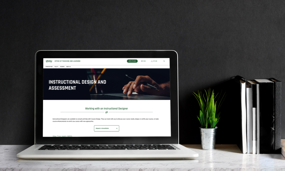
Duration: August - December 2023
Platform: Desktop Website
Role: Designer on a team of designers
Overview: We worked with the Office of Teaching and Learning to redesign their website in order to help UVU Faculty find the information and help they need quickly and easily. We did extensive research into our audience, including: sending surveys, conducting discovery interviews, eye-tracking testing, and usability testing. This allowed us to identify and address some of the current website’s pain points, and propose fixes in our final design.
Defining the Problem
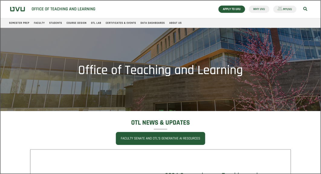
The current Office of Teaching and Learning website is quite vast, redundant, outdated in places, and quite disorganized. Our team conducted an audit of all 87 pages, and took notes as to what content existed and began picking out areas that could be trimmed down. We immediately started noting areas that we could see problems that we should address in the redesign. After meeting with the stakeholders, conducting some user research, and exploring the website ourselves, our team came up with the following problem statement: “The general disorganization of information on the OTL website makes it difficult for UVU instructors, faculty, and students to find the information they need.”
Learning About Our Audience
Something that became abundantly clear to the team and me is that we are just about the farthest you can get from university faculty. We are just college kids that were raised with various technology at our fingertips; we couldn’t make many accurate assumptions about the average UVU faculty member’s experience. So, to learn more about our audience, we implemented the following strategies:
Making Observations
The first thing we did, is attempt to observe UVU faculty members in their own habitat. We headed to the physical Office of Teaching and Learning location in order to see how the faculty interacts/behaves there. We did not see many faculty members walk in, but we did learn that when they do need help, they opt to call or send an email.
Creating a Survey
We also wanted to know what faculty members thought of the Office of Teaching and Learning website. This was eye-opening in particular. We learned that faculty members do not like being inconvenienced, and navigating the OTL website is very inconvenient for them to use when they can just call or email their question.
Conducting Eye-tracking Tests
To wrap up our audience research, we conducted a few eye-tracking tests to evaluate what actually using the website is like. We found that it was difficult to find information quickly, if at all. The layout doesn’t make sense, where things are located isn’t intuitive, and visitors to the site are bombarded and overloaded with information on every turn.
After all of our user research, we created some personas and user journeys that we wanted to keep in mind while making our designs.
Creating Our Design
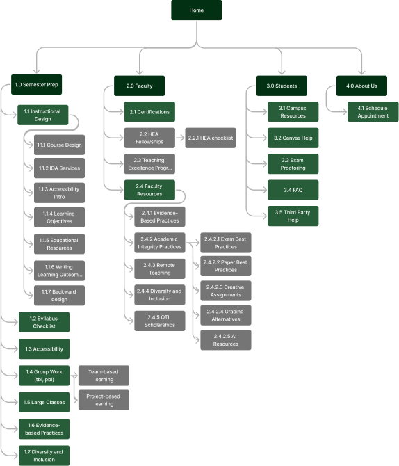
We cut down the number of pages drastically, focusing only on the information that was accurate and necessary. We wanted to make sure that faculty members weren’t overwhelmed by the amount of information available. We also limited the navigation bar to four items, helping it to be clearer to understand at a glance.
We also simplified what content appears on each page, and also pulled focus to the items that are used the most.
Armed with better knowledge about our audience, it came time to create a new design. We chose to focus on cutting down on content, and structuring our website to improve navigation. We wanted our audience to be able to find what they need easily, every time.
Working Within Our Constraints
Our main constraint was simply time. Three-ish months is simply not enough time to fully go through the entire design process without cutting corners. As such, our team will likely not be involved in the development of the new Office of Teaching and Learning website.
There was also an incident in the middle of the semester that caused our timetable to shift up, resulting in parts of the project happen later in the second half of the semester than they should’ve. Unfortunately, that means our design was rushed.
Playing My Part
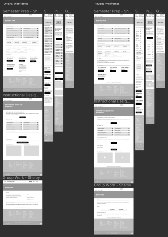
I personally created a large portion of the project brief presentation, conducted two usability tests, did the wireframes and surface comps for three pages, did a portion of the final presentation slides as well as creating the visual design for it, and did the whole Skeleton section of the final Design Document.
The Final Outcome
Overall, I feel this project went very well. Our team worked together well, and every was prepared to go above and beyond in order to bring about this redesign. Having the opportunity to do web design as a team for the first time, and also work with a real client for the first time was amazing. The only thing I would change, is that I wish we had more time to fully refine our design and implement some of the feedback from our usability tests. We also discovered in our final tests that it’s not clear to users which information could be found on the Semester Prep vs. Faculty pages, so we would have combined all of that information if we had time. That being said, this project was still, ultimately, a success.
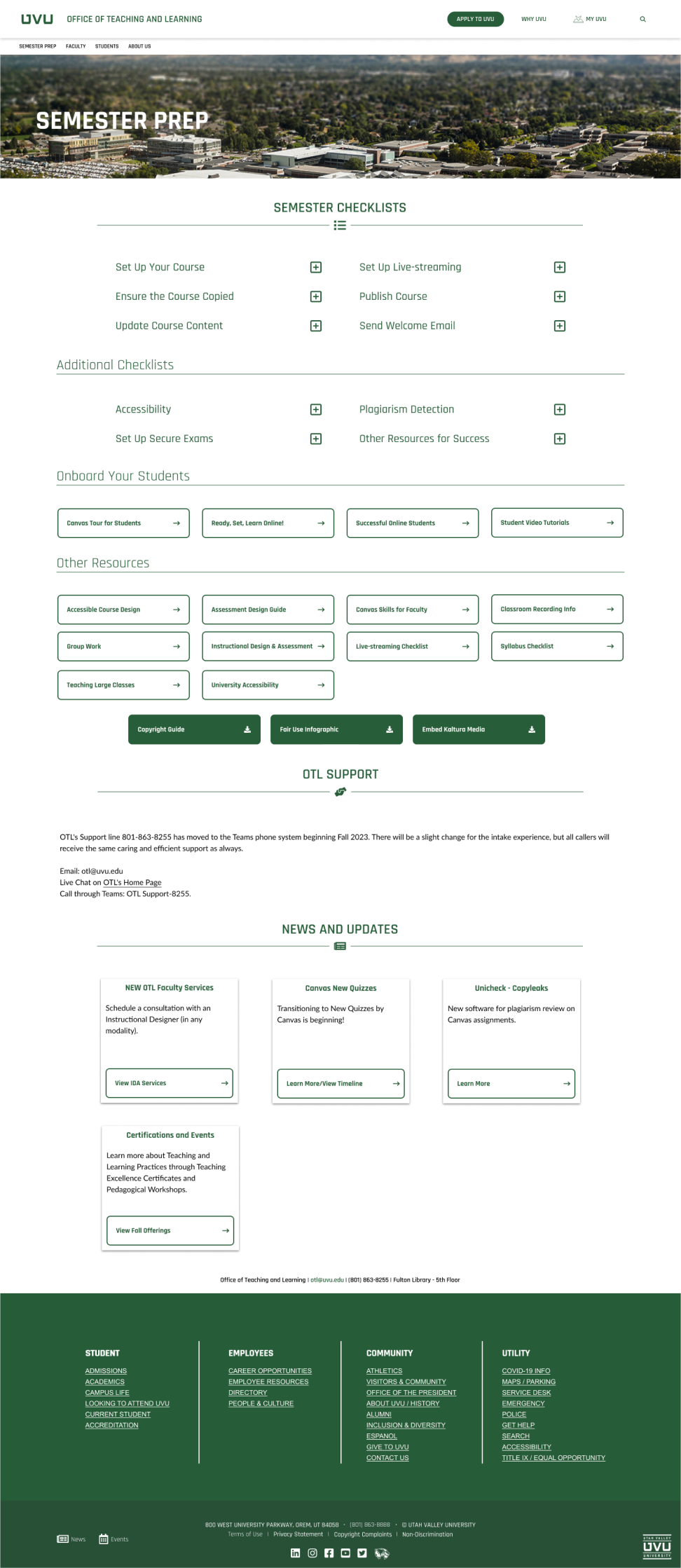
Check out our team's prototype!
Check Out Our Prototype