Virtual Adventures Ahead: Designing an App for Families Visiting Yellowstone National Park
Creating an app to help families traveling with young kids in Yellostone National Park.

Duration: March - April 2024
Platform: Mobile App
Role: Solo Designer
Overview: Creating an app to help those visiting a national park have a more immersive experience.
Defining the Problem and Audience
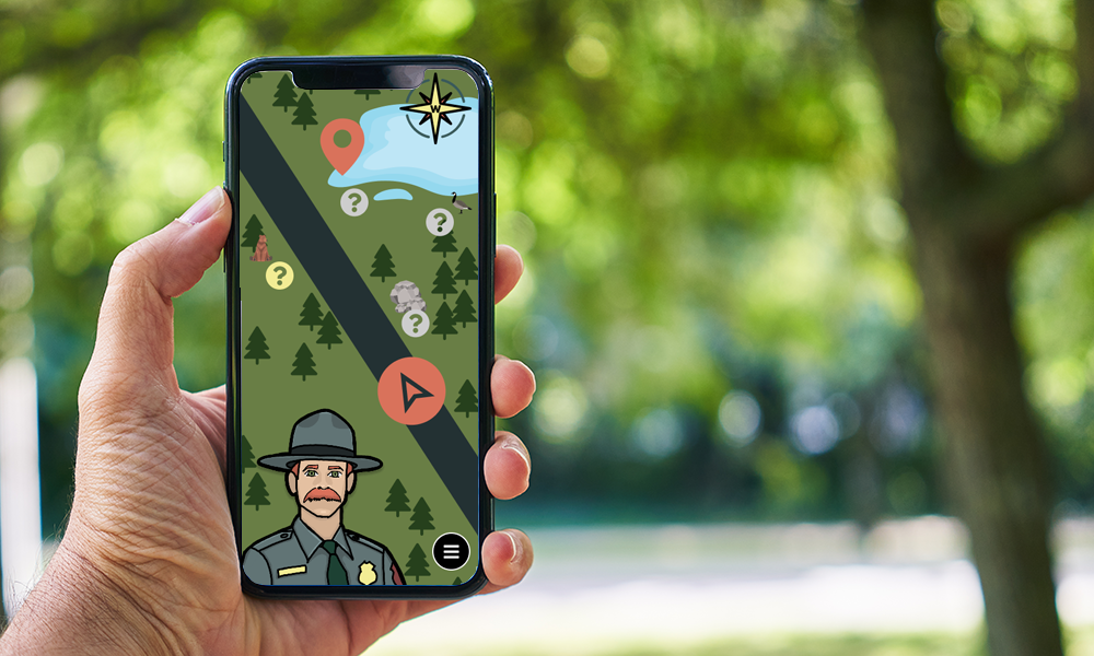
For this project, I decided to create an interactive, virtual tour guide that will help those traveling to Yellowstone National Park keep their kids, and themselves, entertained while driving between sites. Yellowstone in particular is very large, and so the time spent in a car is considerable. This app would help kids stay focused on the park in a fun way, rather than become extremely bored between sites.
What Do Kids Really Want?
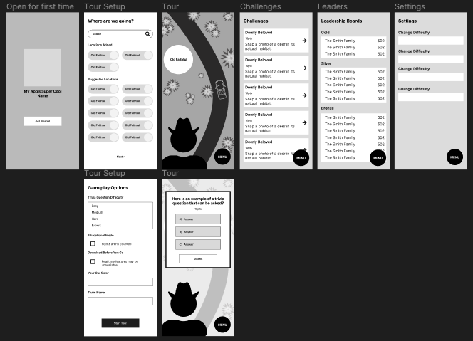
I’ve never designed for kids specifically before, so I wanted to make sure that the app was very interesting but also easy to use. It was a little difficult deciding what features to include in the actual tour itself without just cramming everything I could think of onto a tiny screen. This is where my wireframes come in. I knew that I wanted the map to be abstracted, because it won’t actually be used for navigation itself, but otherwise I wanted to have the tour guide always present and keep the landscape behind them somewhat true to reality.

The Process
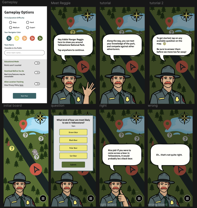
After creating my wireframes and starting to generally get a feel for everything should go, I created my surface comps. But in order to achieve the exact vibe I was looking for, I needed to create the perfect virual ranger. That lead to me drawing Ranger Reggie.
I might have had a little TOO much fun creating Reggie. I wanted him to look like he stepped out of the Firewatch video game (that also inspired my color scheme, by the way). So, the redheaded, mustached man came to be.

Working Within My Constraints
The biggest problem throughout this project, was simply that I didn't know how to prototype my whole idea. I had a hard time deciding how I was going to represent functionality in my prototype, when I didn't think there was an easy way to create an interactive map in Figma. After seeing other people's final projects, though, makes me want to revisit the prototype and see if I can get the map to work a little better.
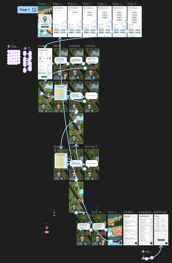
In the meantime, I ended up creating a sort of userflow for exactly how I wanted the use to experience the game part of the tour. I think this really helped it feel real, even though I had to cut some corners in other areas and sacrifice some things that should've worked differently. For example, I had to make it so the menu button doesn't work during the tour. In an actually fully developed app with this idea, that wouldn't be the case and you would be able to navigate anywhere at any time (after onboarding). But there wasn't a a way for me to prototype that without it interfering with the way the tour needed to play out.

The Final Outcome
Overall, I'm very proud of this app. If I knew how to prototype in Figma better, I think I could make a better representation of my idea and I'll probably adjust it in the future. Beyond that though, I think I have a really cool concept and I think it looks really good aesthetically.
Check out the surface comps I made below, and explore my prototype.
 Check Out My Prototype