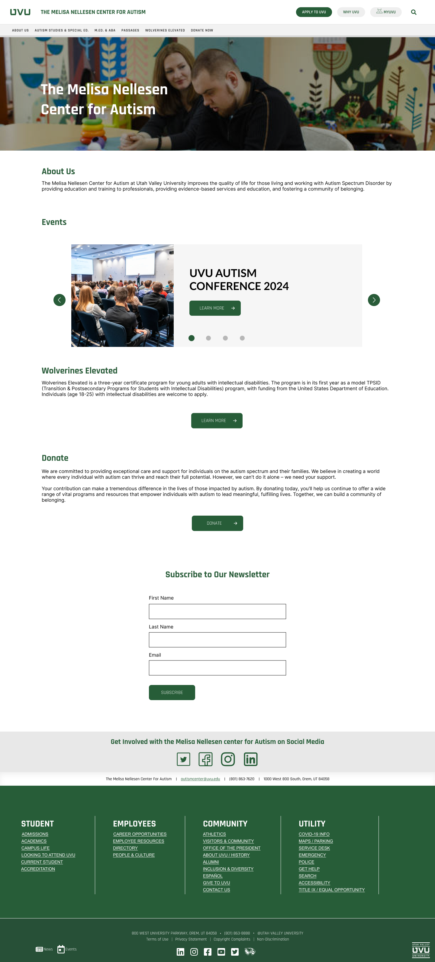
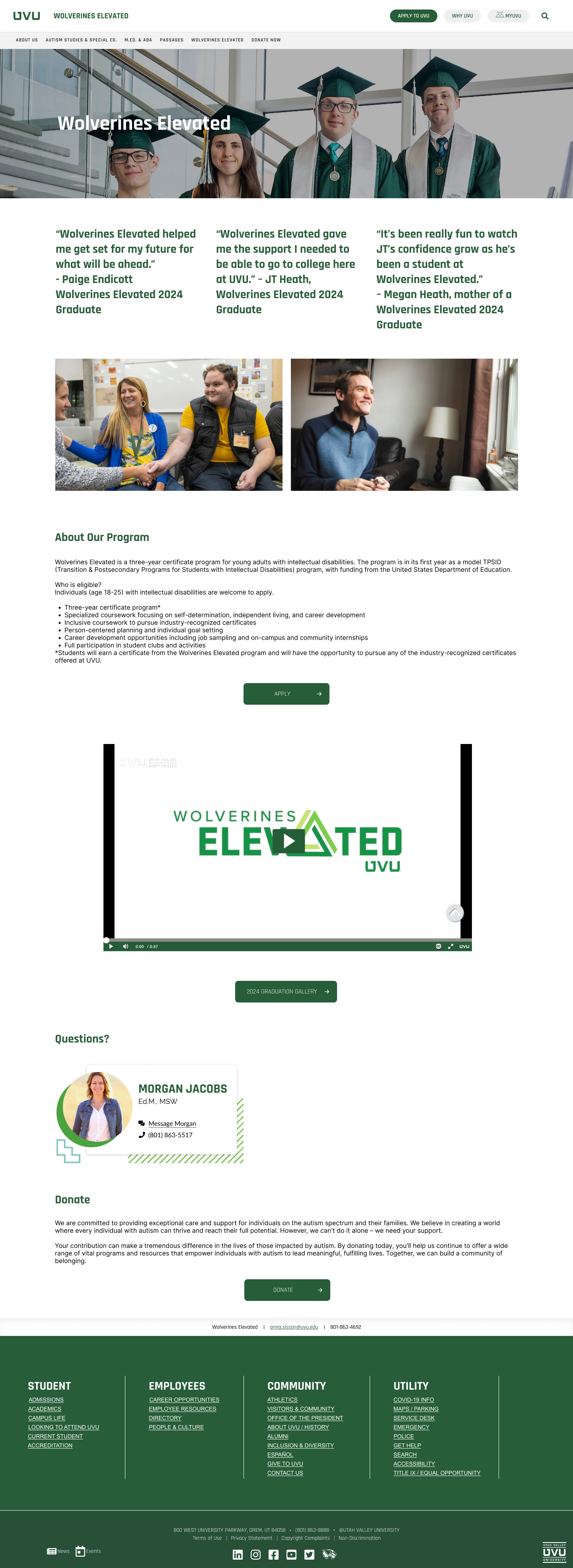
Elevating Marketing Power: Raising Awareness About Wolverines Elevated
Working closely with the Melisa Nelleson Autism Center at UVU to help them attract those interested in participating in Wolverines Elevated.
Duration: May - June 2024
Platform: Desktop Website
Role: Designer on a team of five
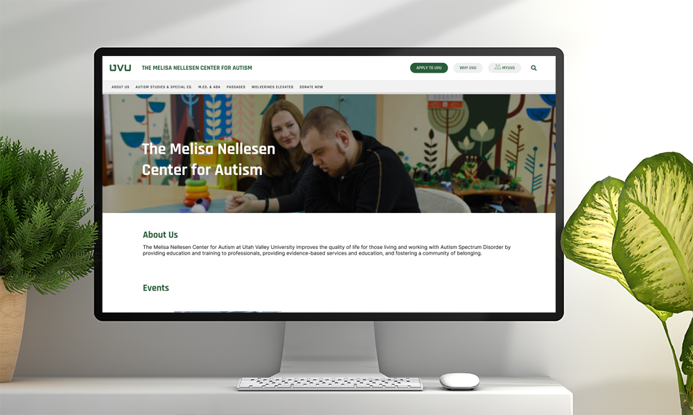
Overview: Redesigning the front page of the Autism Center and Wolverines Elevated websites in order to raise awareness about related services and programs.
The Project Background
This project was part of a the UVU "Summer Design Sprints", which allows students to gain more experience working with real clients over the summer. This optional event was an amazing opportunity that I was excited to take advantage of. However, there were some bumps on the road to success due to an uneffective team dynamic. I'll get to that later.
The first thing we did was meet with our client to learn more about how we could best serve the Melisa Nelleson Autism Center at UVU. Our client informed us that the Autism Center website and the Wolverines Elevated website both needed serious updating/beautifying. Unfortunately, the design sprints only take place over six weeks so we knew from the beginning that we could not redesign two full websites.
In order to maximize the impact of a redesign while also keeping our timeline in mind, I proposed just focusing on the home pages of each website. By making the first thing seen on each website as good as possible, we can buy the Autism Center time to decide how they want to redesign both whole websites in the future.
Focusing in on The Problem
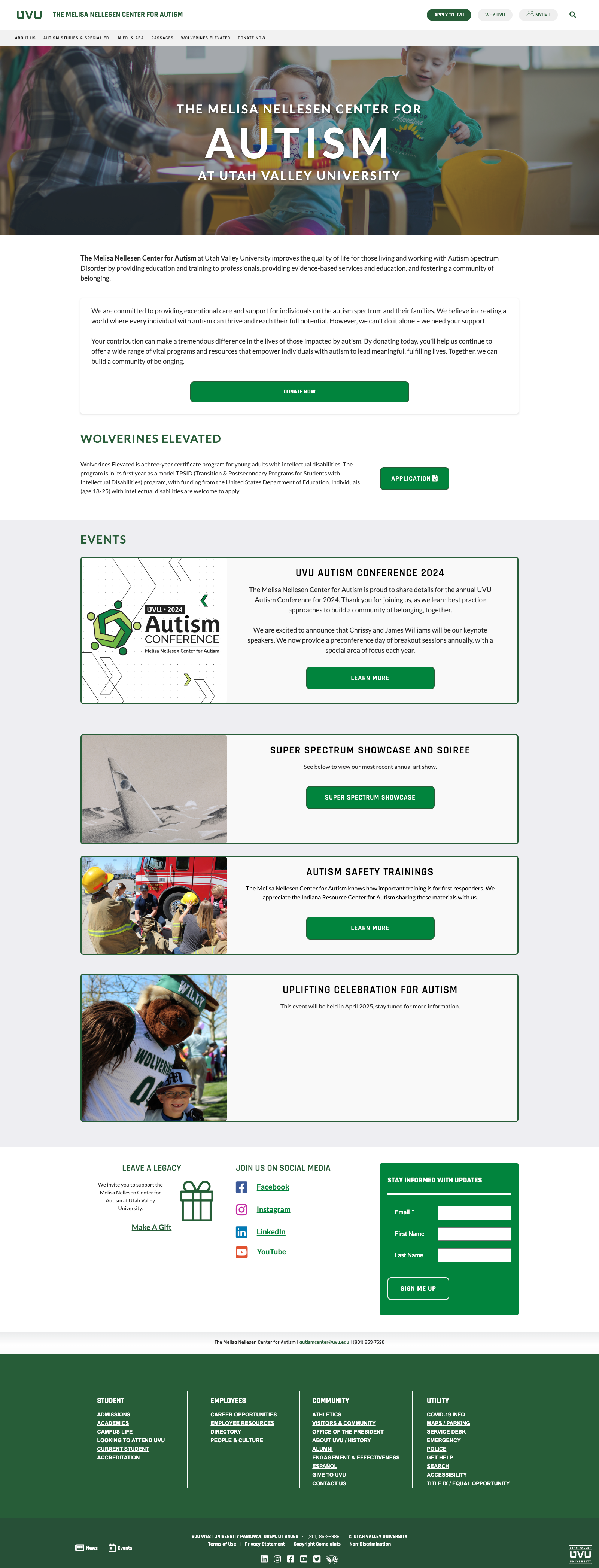
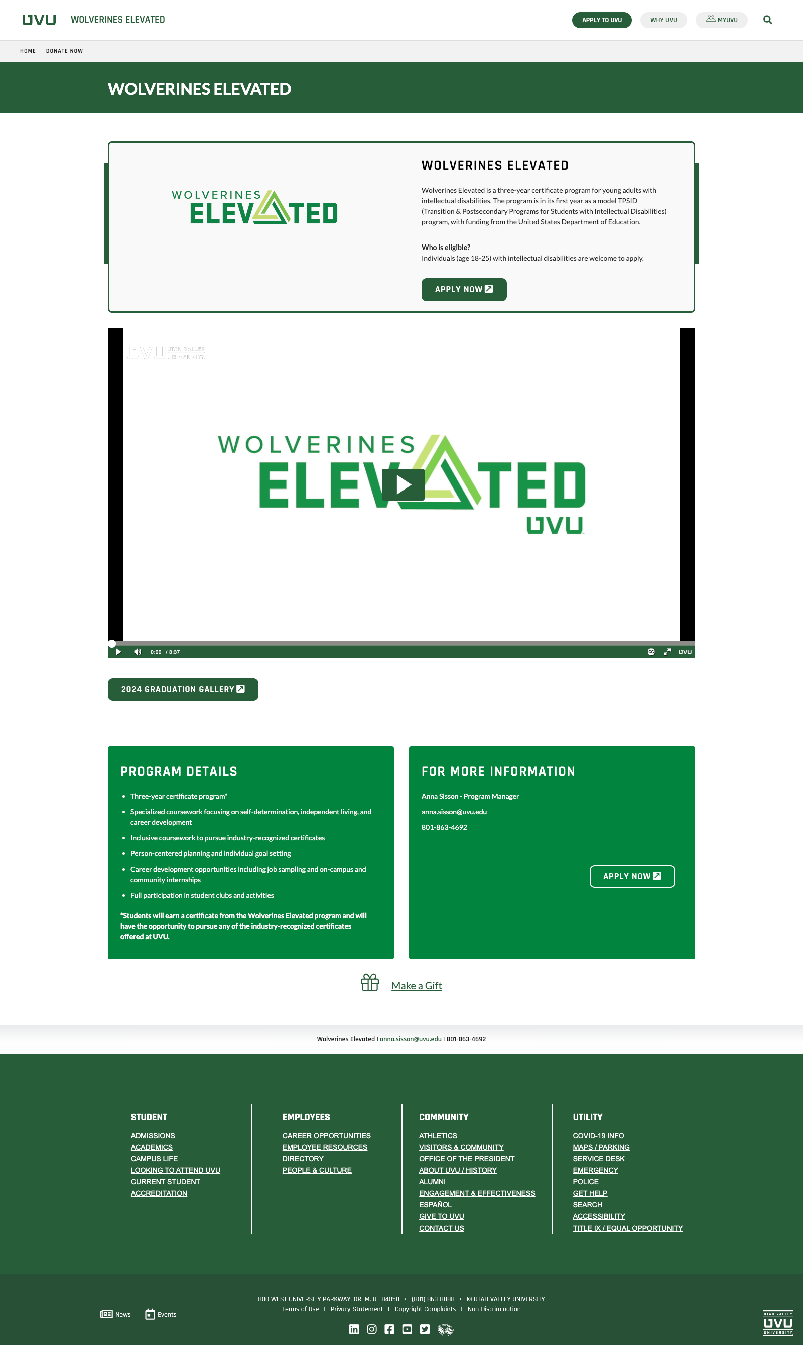
During our first meeting, we went through each home page with our client and had them tell us about what they liked and disliked about the website. They informed us (and we agreed) that the structure of the Autism Center page was confusing and frankly weird. There were elements that had nothing to do with eachother chunked together, and the event cards were big and clunky. The Wolverines Elevated page was very boxy, and the information wasn't organized well making it hard to understand what the Wolverines Elevated program is about. This was especially concerning as the program helps those who are intellectually disabled recieve college credit, but the site made it hard to know how to participate and what the program entailed.
Getting to Work
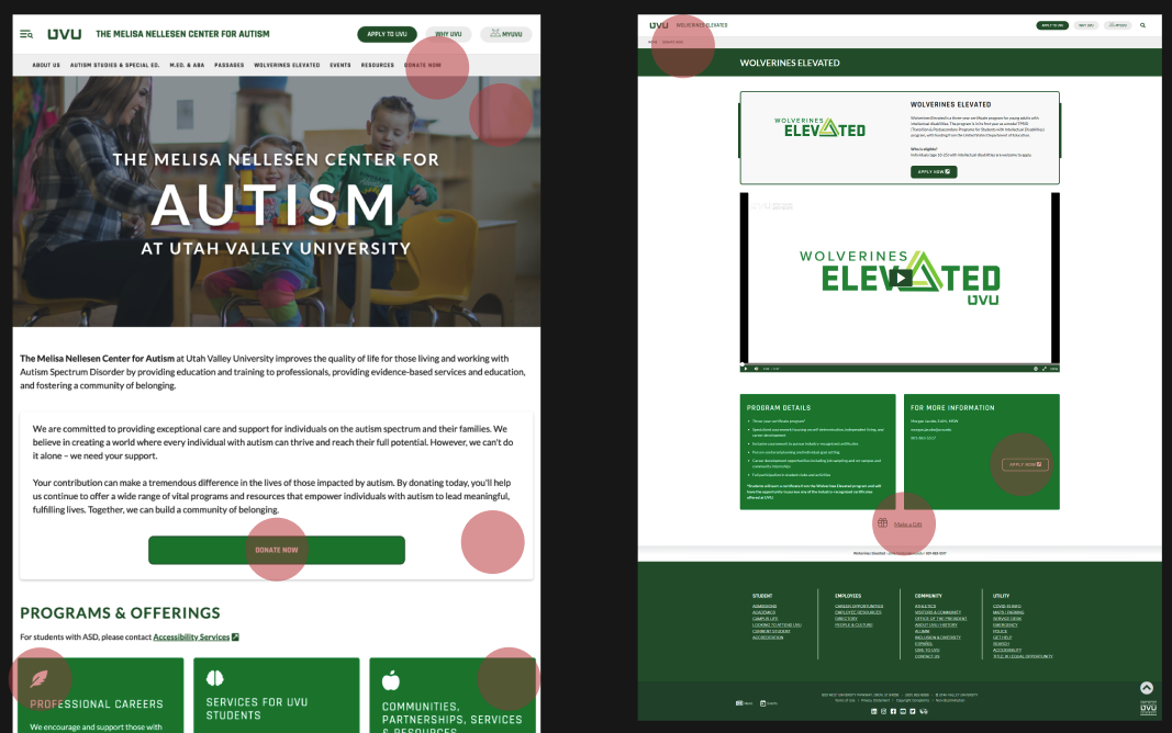
At our first team meeting (without the client), we decided to perform a heuristic markup of the current pages, and look at other sites for inspiration. After this, things took a turn.
Confusing Team Dynamics
Our team leader had no experience leading a group before, and I'm very sorry to say that it showed. At this point, she stopped being reliable and communication between her and us, and her and the client became very difficult to navigate. Due to this, she was not available to help review sketches and come up with a team design to make wireframes. When we later presented the wireframes to the client, it was the first time she saw them as well.
As a result, our team and productivity greatly suffered. We weren't sure what we were supposed to be doing individually, and our soft deadlines kept getting missed. Any communication recieved from our leader was prompted by another specific team member, and myself.
The reactions to the lack of leadership were mixed, some team members stopped helping completely while I and the other particular member did our best to pick of the slack.
Who Needs Research When You Have Gut Feelings?
Because we had essentially no leader, things that should have been essential to our process got dropped. We created a survey in order to learn more about our audience early on in the process, but our leader did not follow up with the client to make sure it got sent out. As a result, our design has no research except unless you count creating a mood board of similar websites.
This bothers me so much. We cannot say that our design improved the websites in any meaningful way, it's based on nothing but vibes. This project unintentionally became about UI design when we set out to do UX. I really wish we had the time and coordination to complete thorough research and testing, but that wasn't an option for us because, before we knew what hit us, we had reached the end of our time.
Not A Total Fail
Now, I may personally grumpy about the way this project worked out, however, that does not mean that it wasn't somewhat successful. When we met with out client and their supervisor for the last team, they told us that they were absolutely in love with the design. That the websites looked and felt so much better. And at the end of the day, it's important that the client is happy.
Moving forward, however, I've truly learned how important having a reliable, confident leader is when working on a project. I didn't fully appreciate that before, and although this was a rough way to learn it, that was still an incredibly valuable lesson to me. It's taught me that I want to work with great leaders, but also that I want to make sure that I become a great leader. And I have vowed to always be reliable, communicate well, and go above and beyond whenever I can in a project.
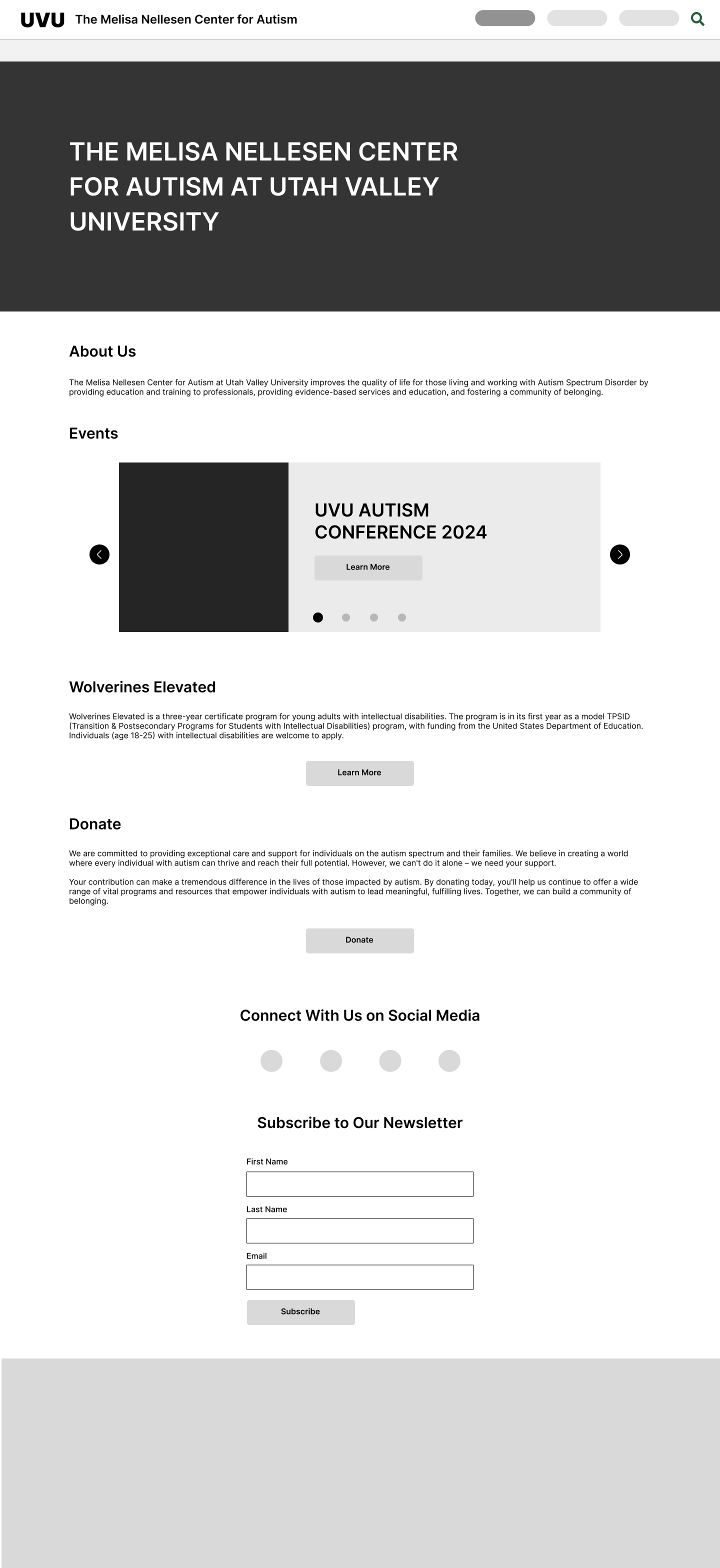
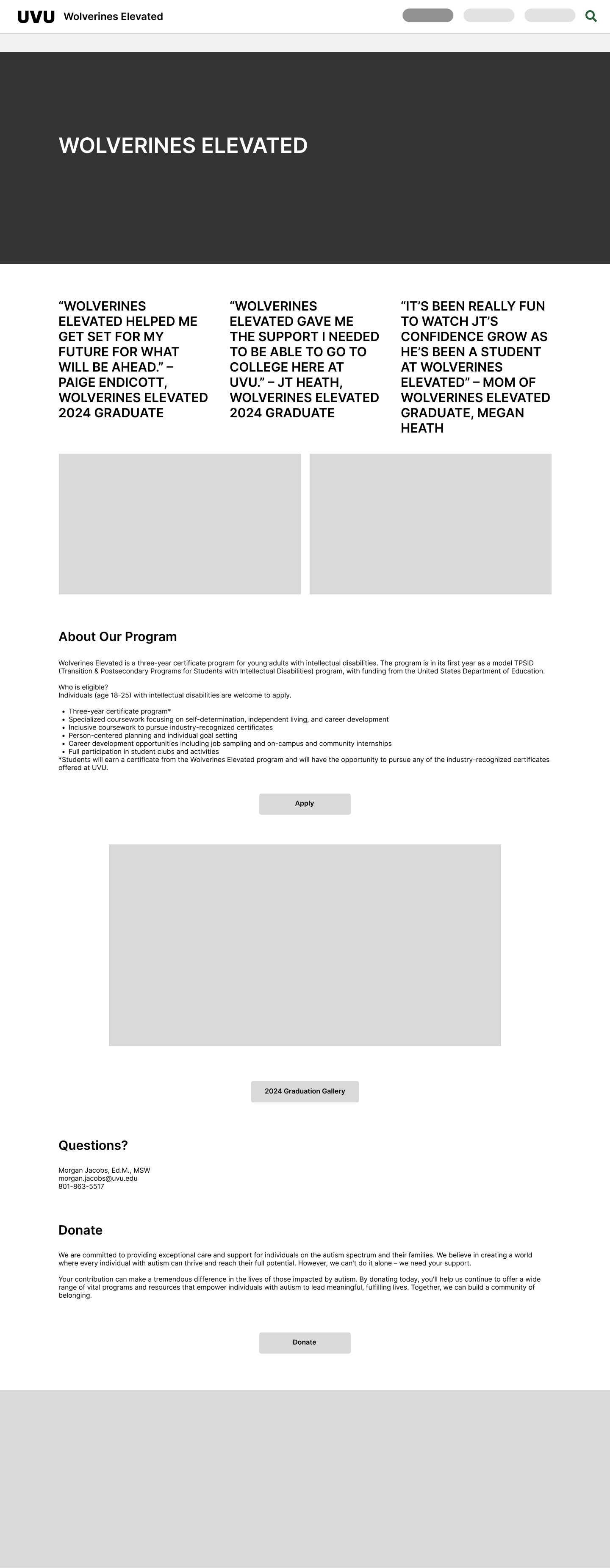
See our final design below.
